Horizon Inspection Software by Carson Dunlop
Elevating Home Inspections: A Comprehensive Redesign of Horizon App by Carson Dunlop
Horizon has been a trusted name in home inspection software, known for making the transition from paper to digital inspections approachable for inspectors. As a Product Designer on the product team, I was tasked with reimagining the app's user experience while preserving the simplicity that made it accessible to inspectors of varying technical abilities.
My Role
User Interface Design, Interaction Design, Visual Design, User Flows, Rapid Prototyping
Date
2024


The Problem
Problem Statement
Home inspectors using Horizon's software frequently struggle with basic inspection tasks due to an outdated interface. When performing inspections, users must navigate through complex menu structures to access essential features like photo documentation and report generation. Because the app's interface hasn't evolved with users' needs while maintaining its simple approach, inspectors are switching to competitors' more intuitive solutions. This situation frustrates loyal users who value the app's simplicity, impacts inspection efficiency, and represents a significant loss of market share for Horizon.
The Problem
Problem Diagnosis; Root Causes
Our investigation into Horizon's user experience challenges involved extensive direct user research. We conducted in-depth interviews with 15 active inspectors representing different experience levels and company sizes. To gain firsthand insight into real-world usage, we shadowed five inspectors during live home inspections, observing their workflows and pain points in context. We supplemented this with interviews from our sales and support teams who provided valuable perspectives on user challenges and common complaints.
To understand our market position, we performed a thorough competitive analysis of the top three inspection software platforms. This included evaluating their feature sets, analyzing app store reviews and ratings, and documenting how they addressed similar user needs differently.
Finally, we analyzed usage data from our existing platform to identify patterns in how inspectors actually used the software versus how it was designed to be used. This revealed critical gaps between our intended user experience and real-world application.
The Users
Users and Audience
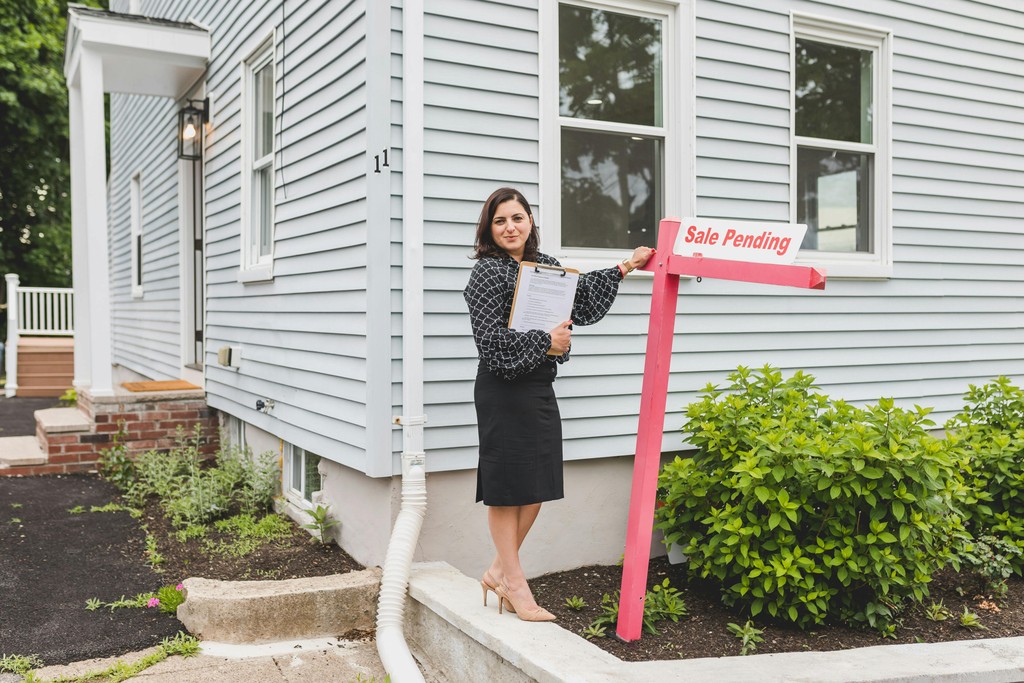
The primary users of Horizon are professional home inspectors who depend on the app daily to book inspections, perform detailed home inspections, generate reports, and manage invoices and contracts efficiently.
Secondary users include real estate agents, homebuyers and sellers who access the inspection reports generated by the app to make informed decisions. The redesign aimed to address the needs of these users by enhancing the app’s usability and making it more responsive to the demands of modern inspection workflows.


The Problem
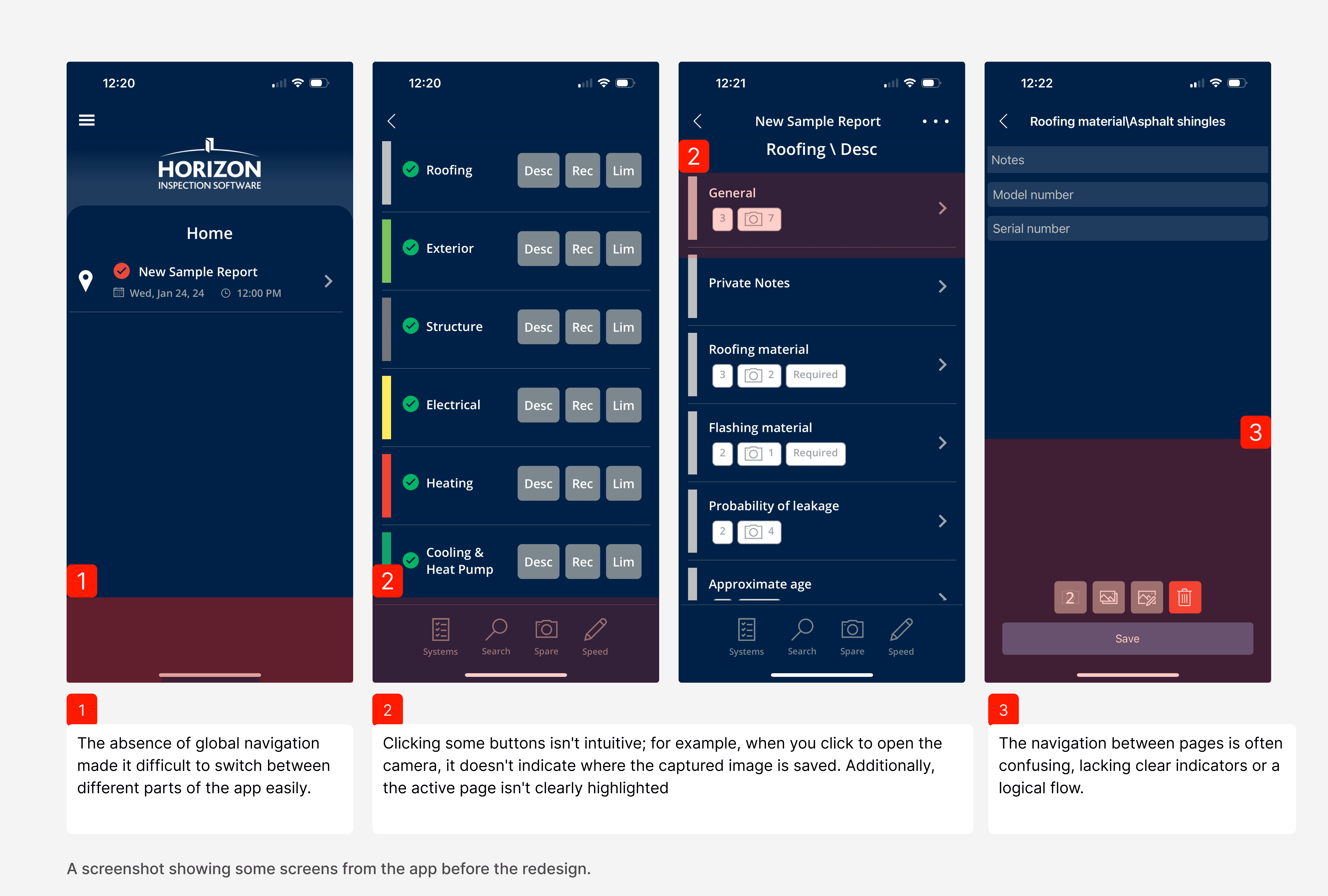
Aligning Vision and User Experience: Stakeholder Insights and Usability Testing of the current app
To initiate the project, we held a call with key stakeholders at the company, including CEO Alan Carson, who shared his vision for both the company and the app. He emphasized the need to modernize the app to enhance its competitiveness in the market and increase its appeal to users. Alan pointed out the aspects of the app he currently appreciates as well as areas for improvement. His insights are crucial to ensuring that the redesign aligns with the company's strategic direction, market positioning, and long-term goals.
We also conducted usability testing sessions with inspectors, who are the primary users of the app. During these sessions, we observed them live as they completed inspections using the current app. This allowed us to listen to their pain points and understand what they liked and disliked about the existing design. Their feedback was invaluable in identifying areas where we could make improvements to better meet their needs.
Research
Research Findings: Key Reasons for Redesigning the Horizon App
Our user research revealed that while the Horizon app has room for improvement, it was generally well-received. Users valued its simplicity and ease of use, especially older inspectors who are less tech-savvy.
Our research has identified several critical areas where the Horizon by Carson Dunlop app could benefit from a redesign:
Outdated User Interface (UI)
The current design looks dated, making it less appealing and harder to use compared to modern apps
Usability Issues
Navigation has become complex, and workflows are cumbersome
Performance Enhancements
Users expect faster, more responsive apps.
User Feedback
Pain points like confusing menus and missing features need addressing
Competitive Pressure
Competitor apps with modern designs and advanced features are attracting Horizon's user base.
Accessibility and Compliance
Enhancing accessibility features and ensuring compliance with new industry standards
The Constraints
Navigating Constraints: Prioritizing Features and Planning for a Timely MVP Launch
As a small team tasked with redesigning the app while the main team focused on maintaining the existing version, we faced constraints in team size, budget, and time. With marketing already promoting the new app, we were under pressure to deliver quickly. To manage this, we created a feature prioritization matrix and a project timeline, focusing on delivering a functional MVP and planning additional features for gradual rollout. This approach allowed us to meet the immediate needs within our constraints while paving the way for future enhancements.
Modernize the User Interface (UI)
Goal: Update design to be visually appealing and intuitive.
Metric: 25% increase in user satisfaction related to the UI.
Improve Usability
Goal: Simplify navigation and workflows.
Metric: 30% reduction in time to complete inspection reports.
Maintain Competitiveness
Goal: Integrate modern technologies and features.
Metric: 10% increase in market share within a year.
Incorporate User Feedback:
Goal: Address user pain points and integrate requested features to improve the overall functionality of the app.
Success Metric: A 50% decrease in the number of user-reported issues post-launch and the successful integration of the top three requested features.
Iterations
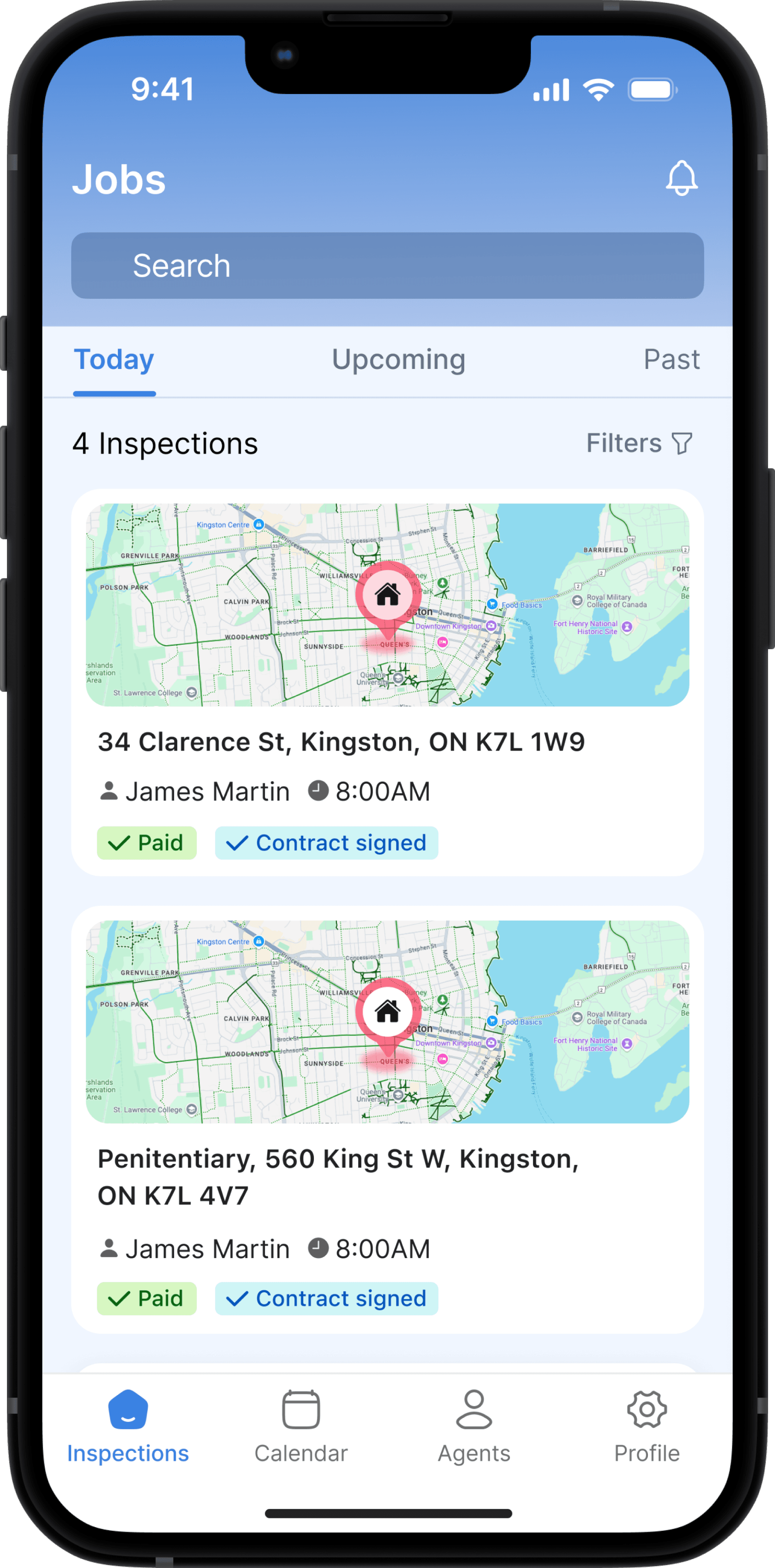
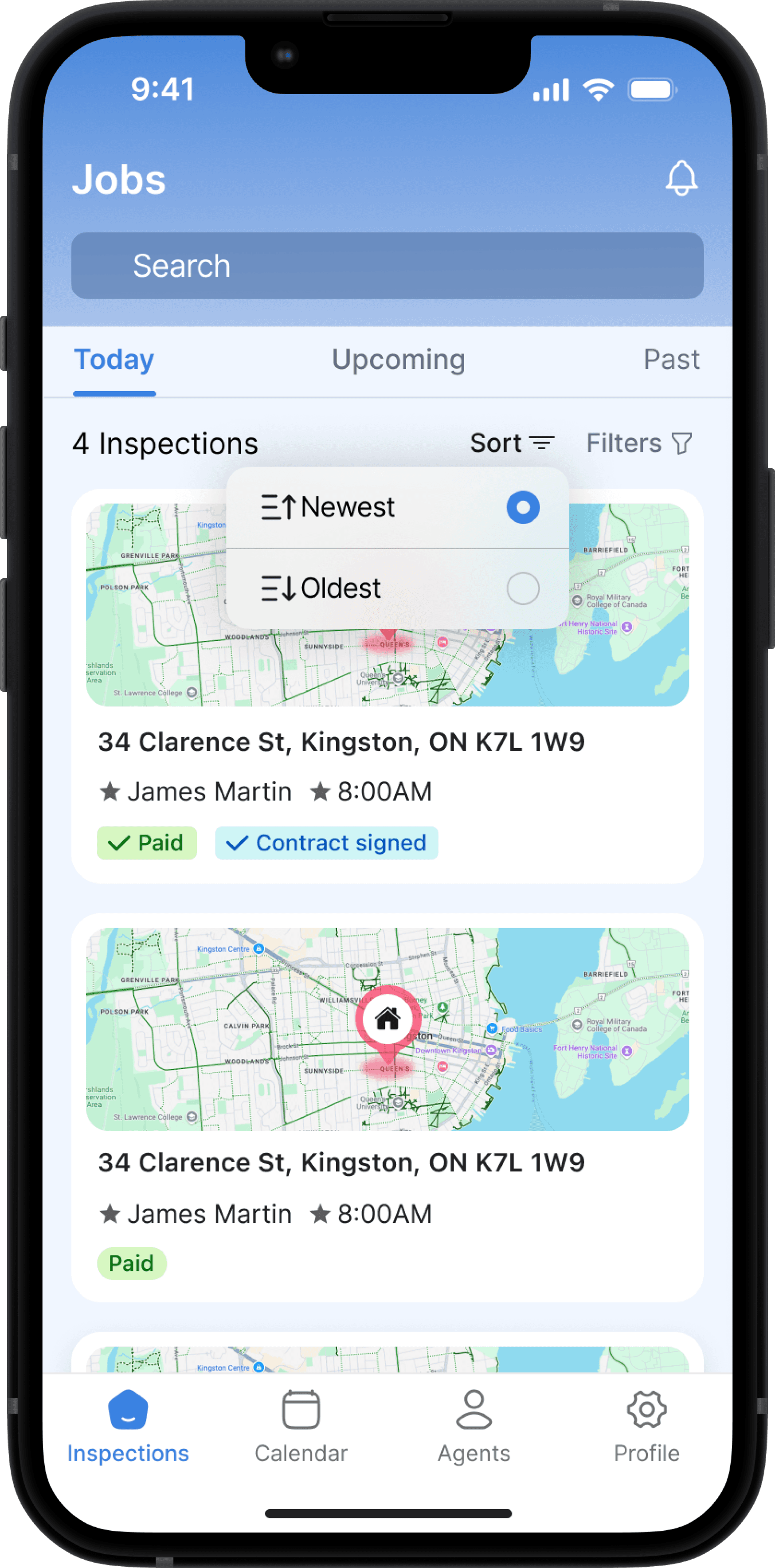
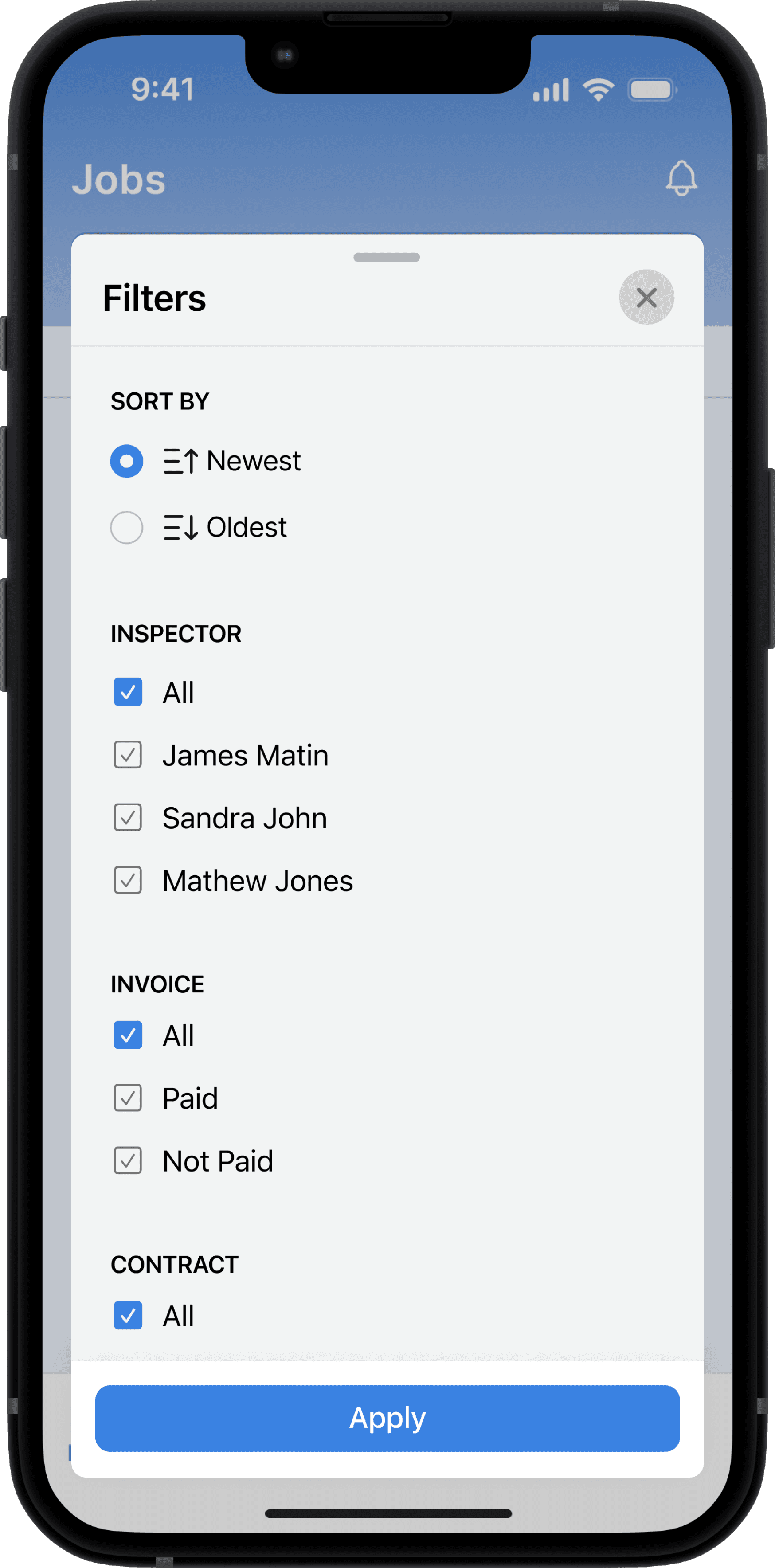
Designs iterated by concept testing and feedback
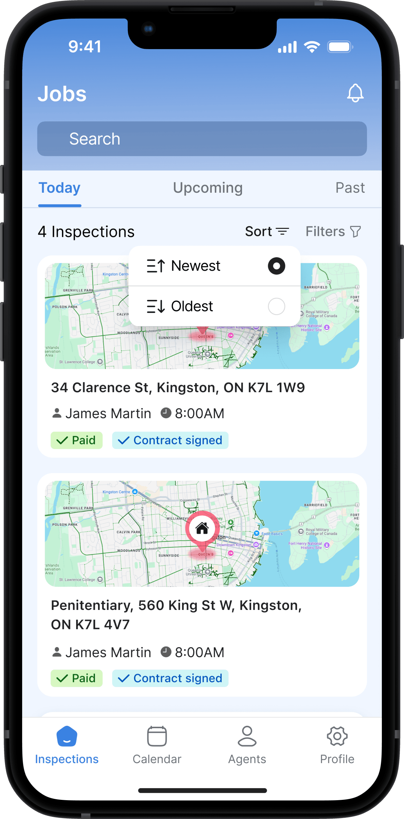
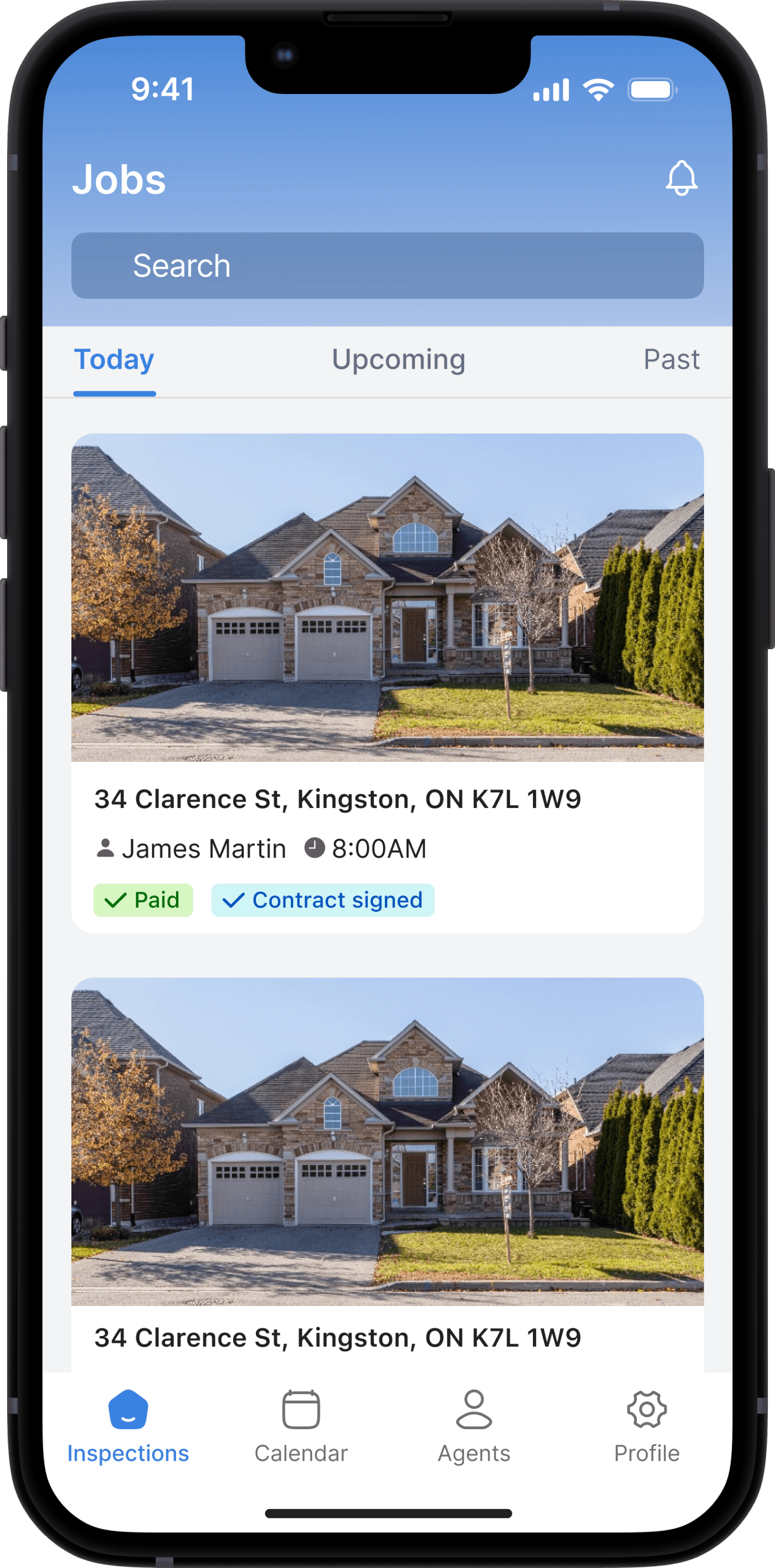
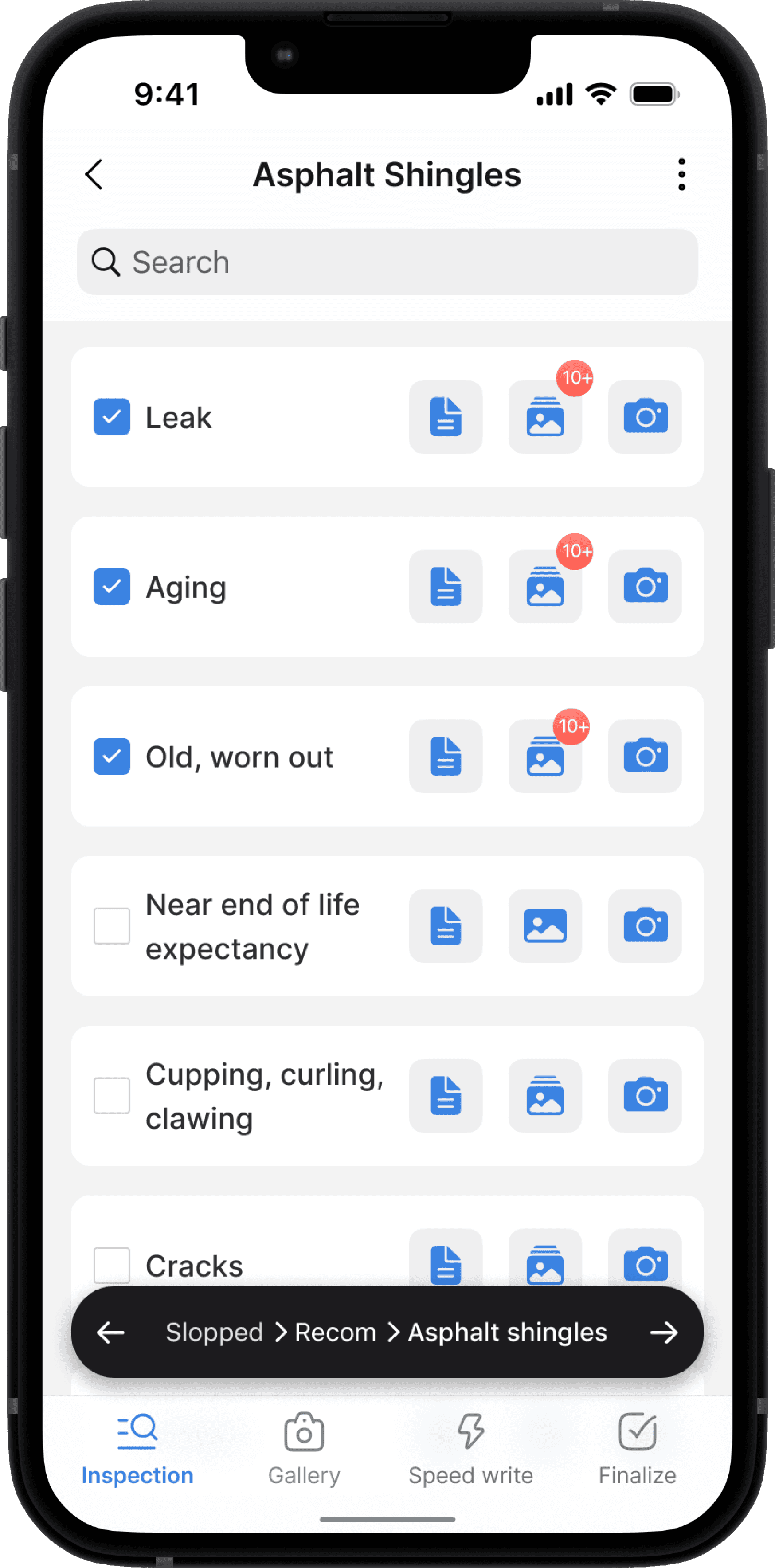
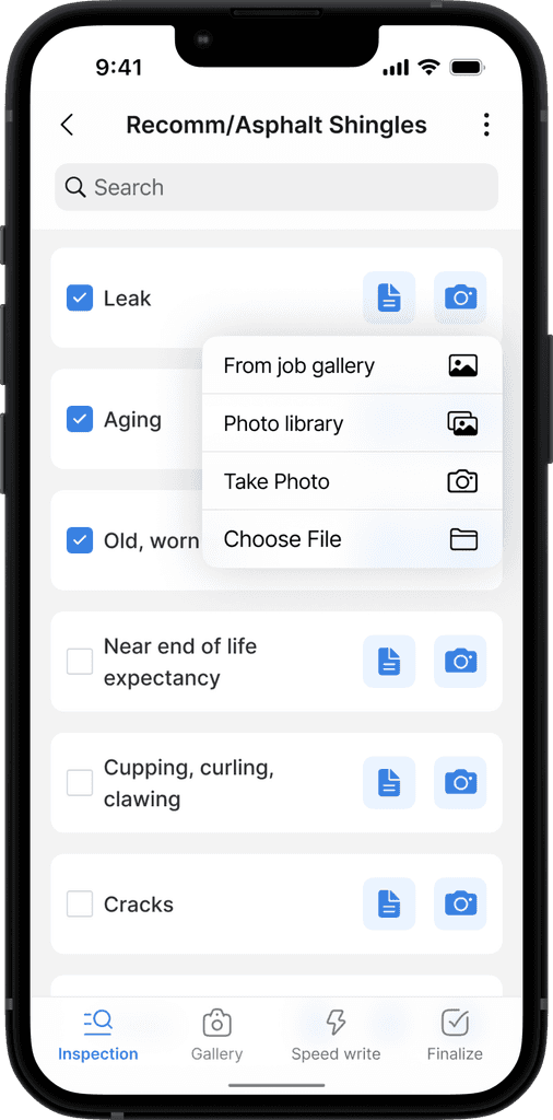
Through iterative design, driven by concept testing and feedback, we refined key features of the app. Below are the major changes made based on insights gathered from user testing and internal design critiques
Report writing
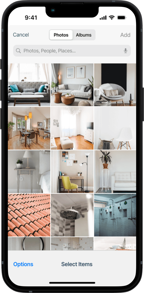
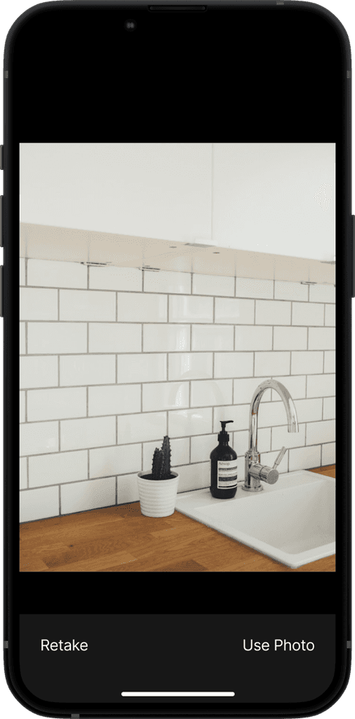
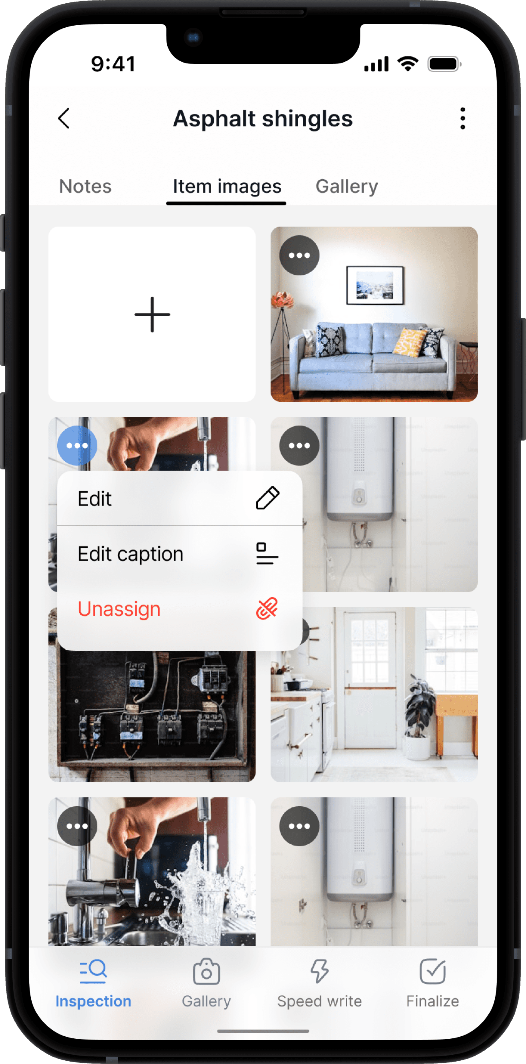
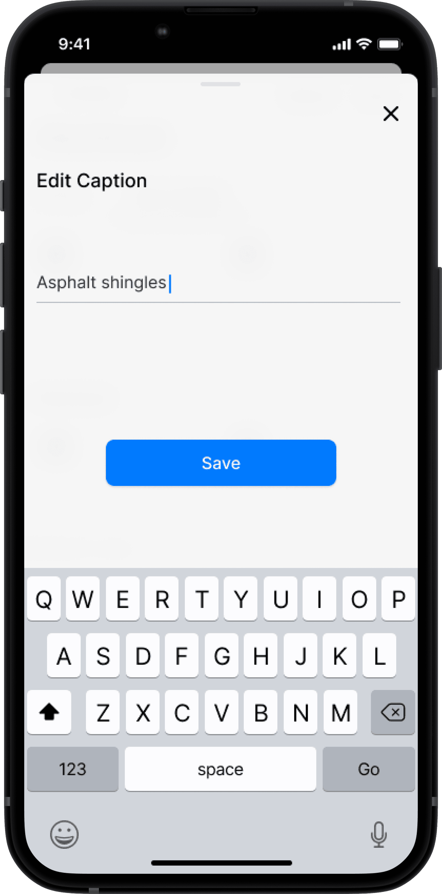
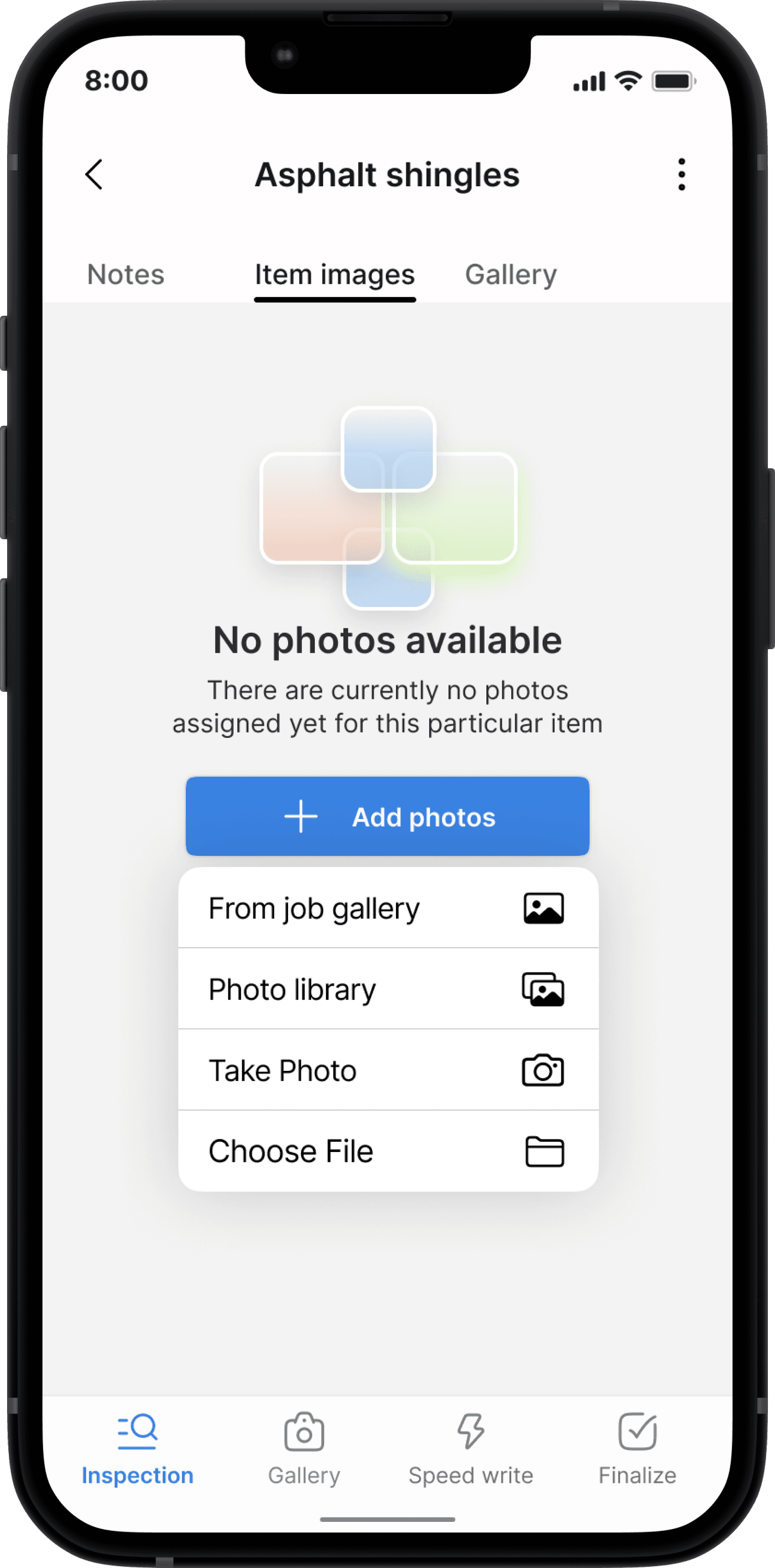
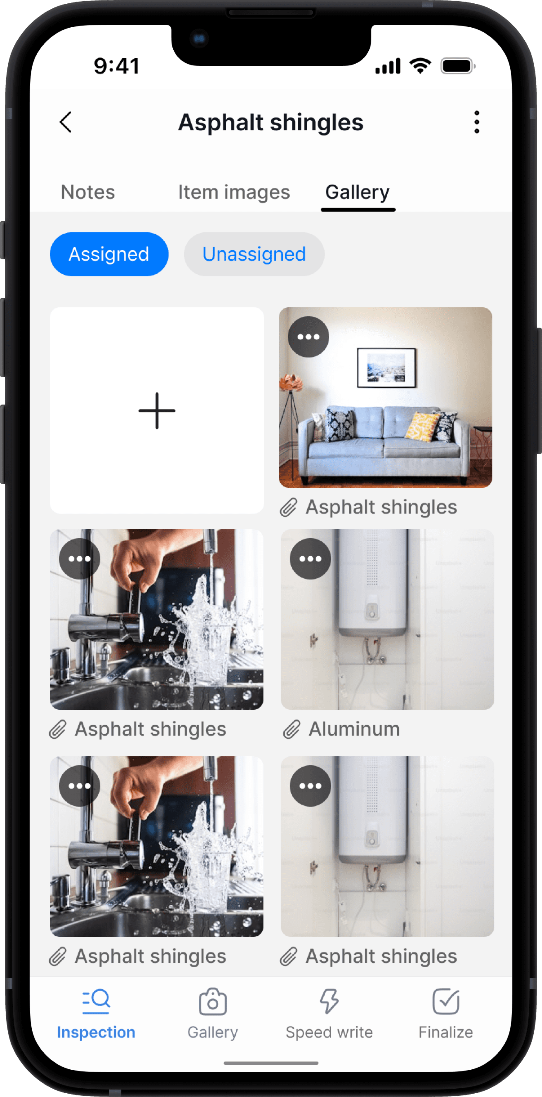
Design iterations 2 (Assigning images)
Get this template for free
Get this template for free
Designs
Designs
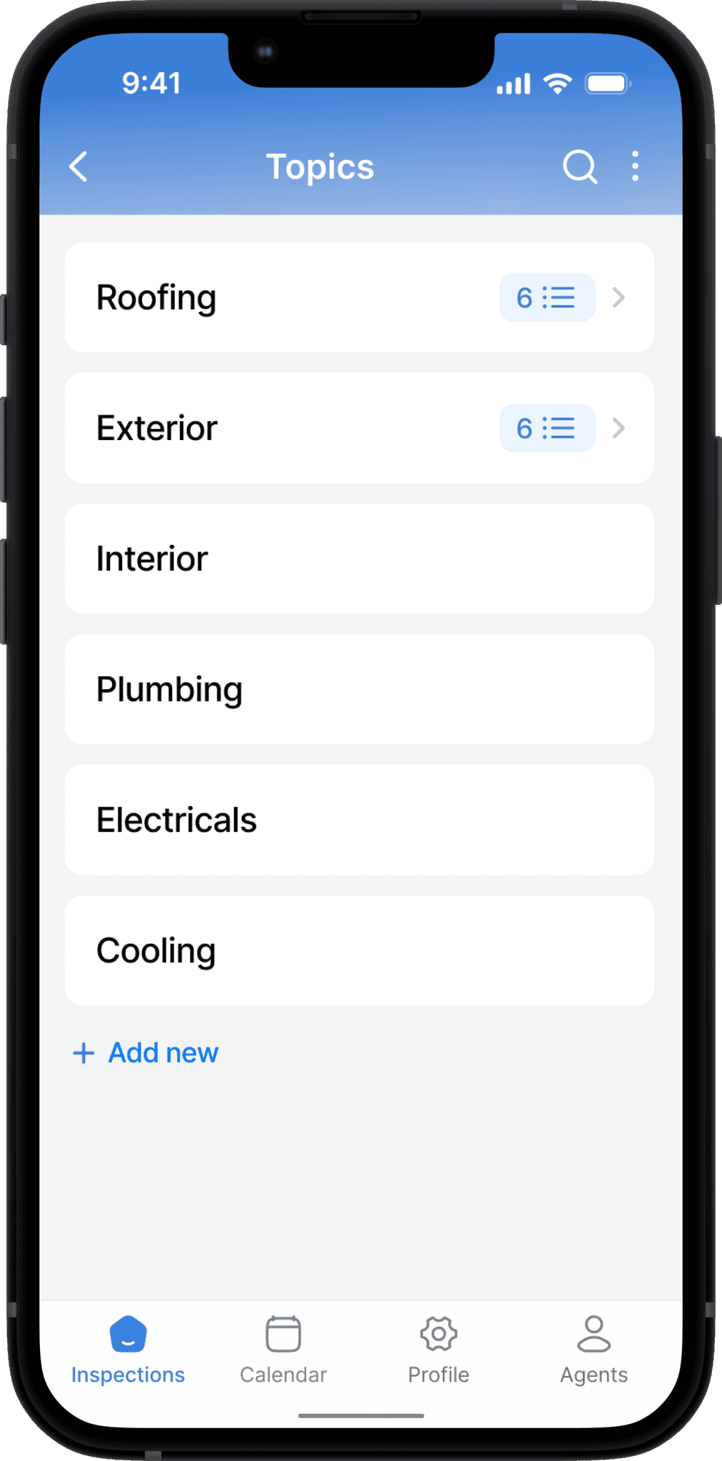
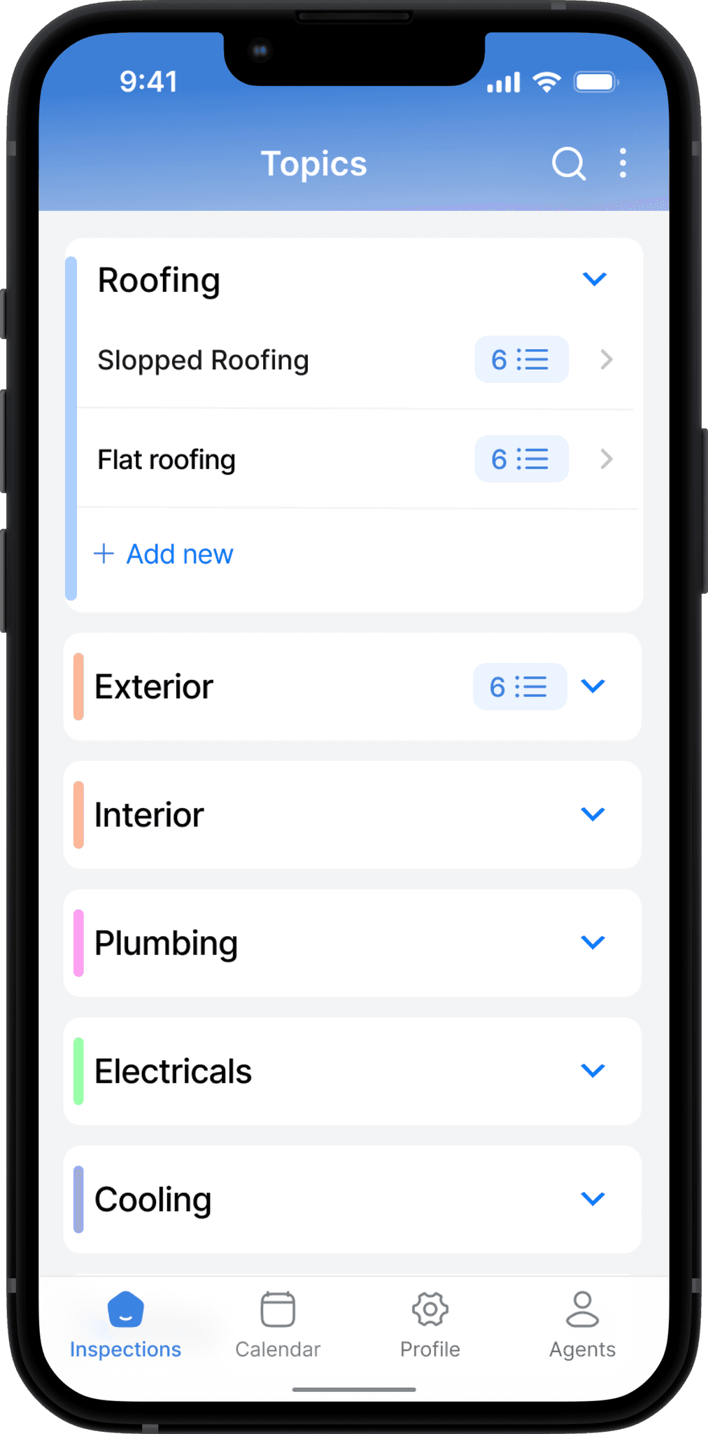
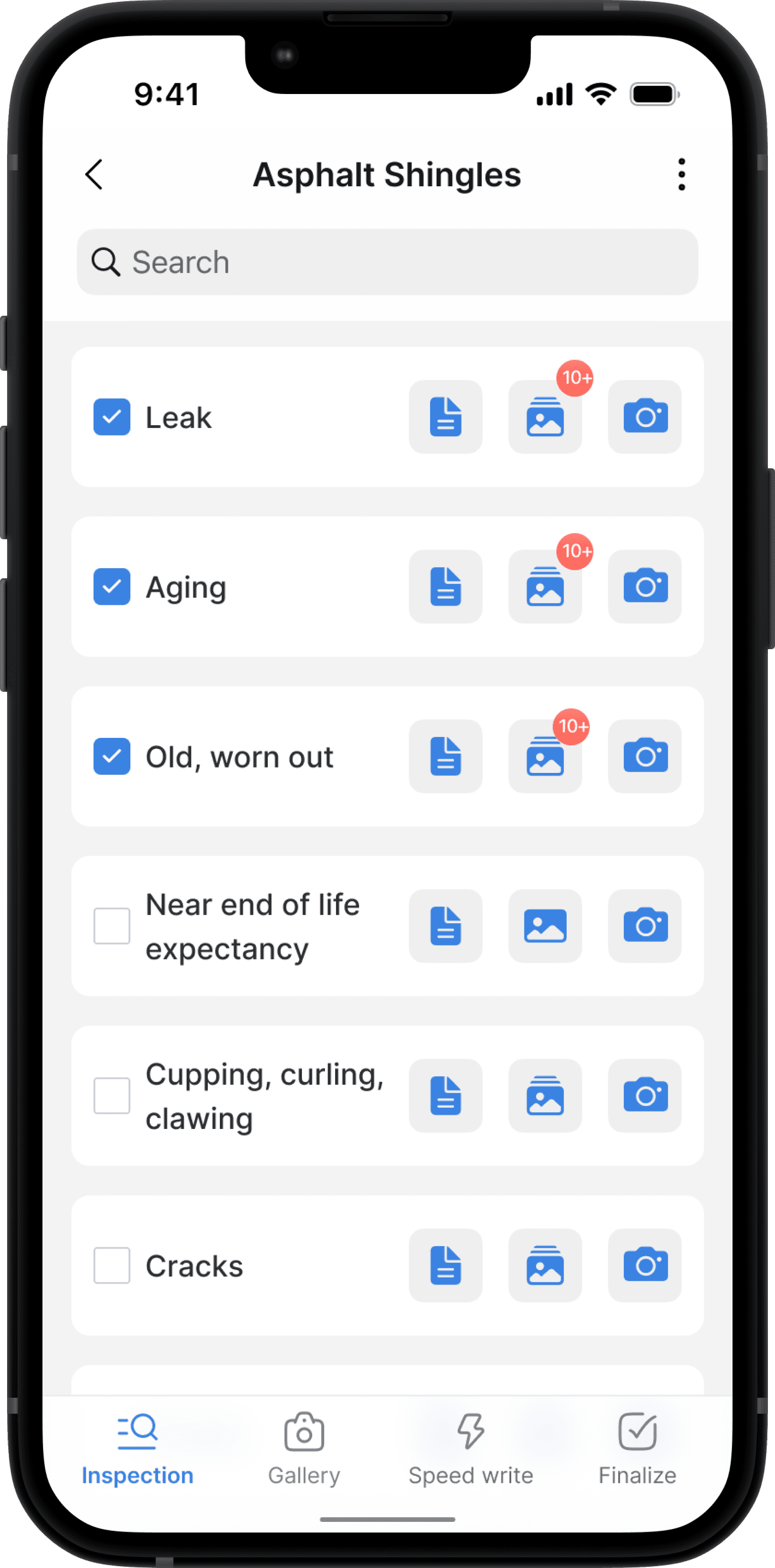
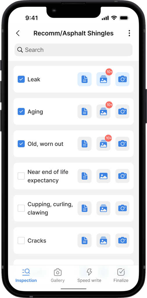
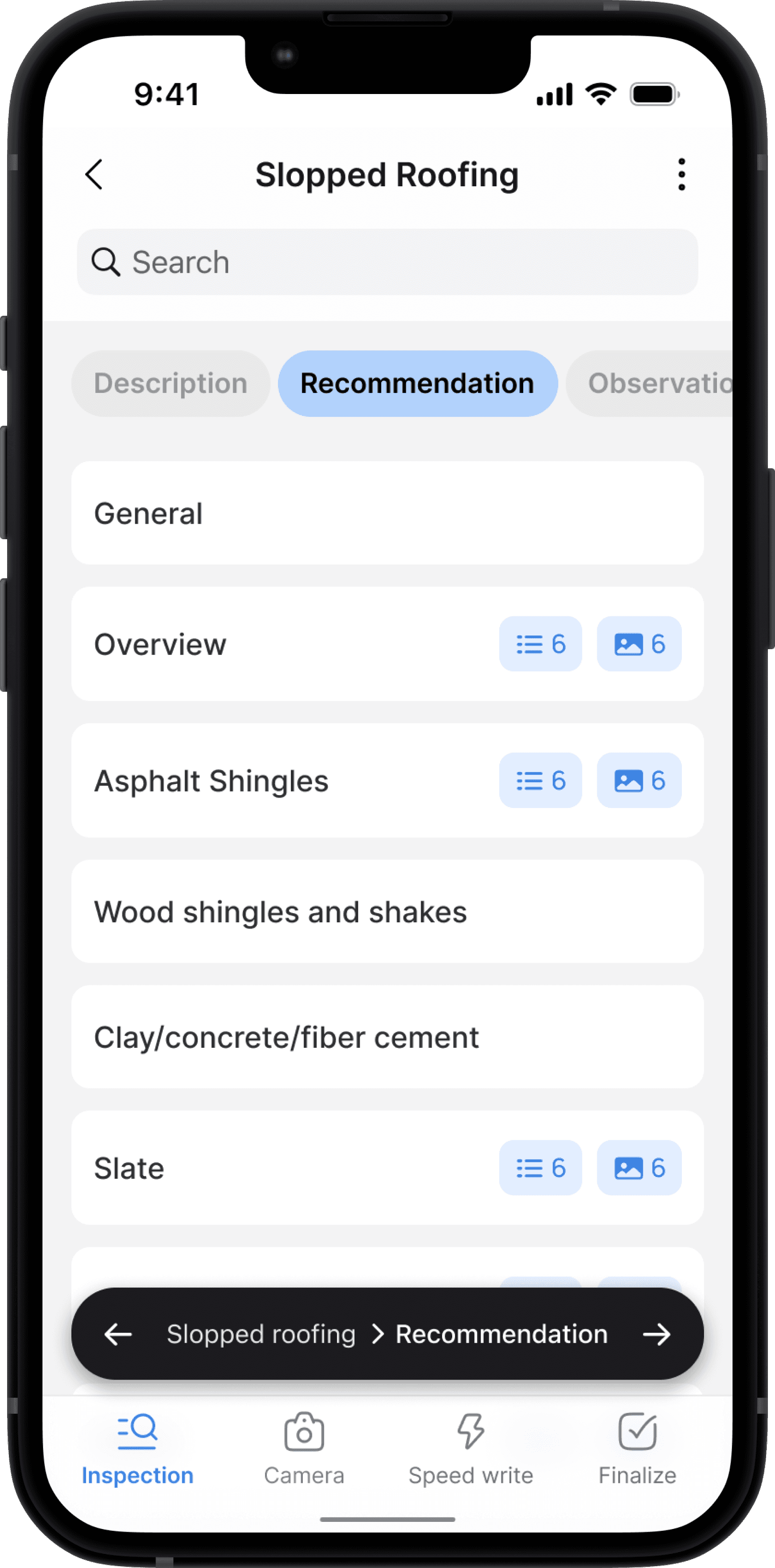
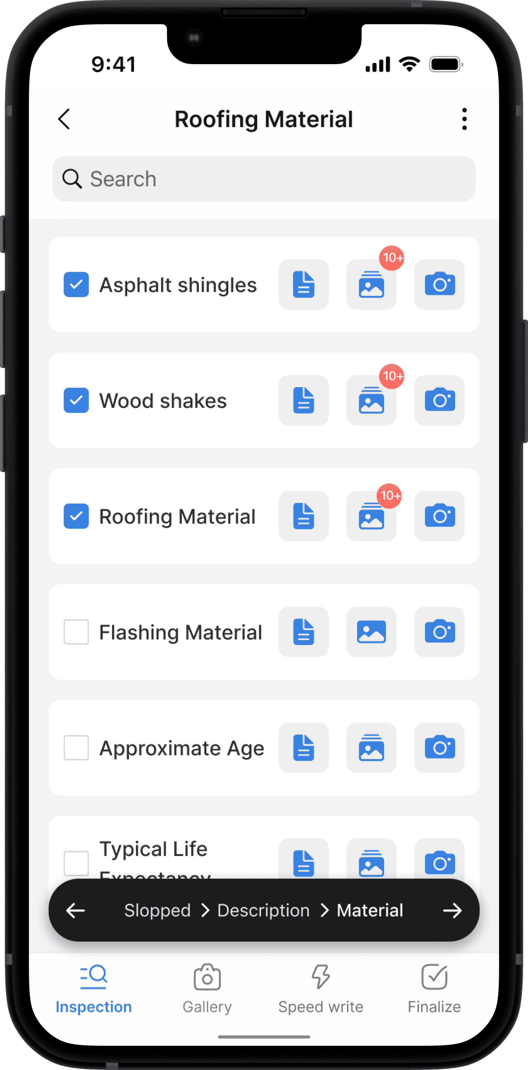
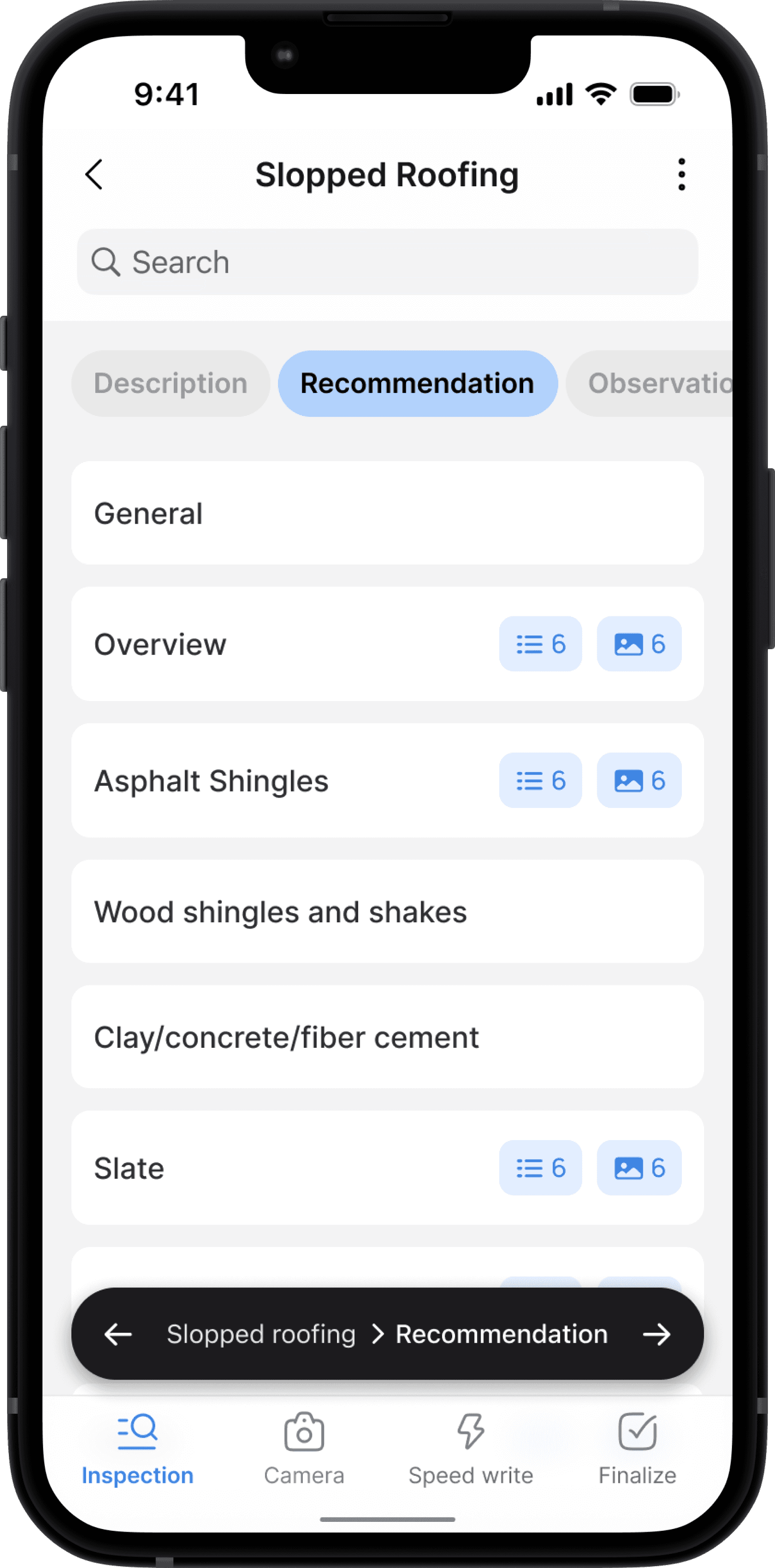
In the Horizon app, the major parts of a house are organized into topics such as Roofing, Exterior, Structure, Electrical, Heating, Cooling, Insulation, and Interior. Each topic is further divided into headings, like Sloped Roofing or Flat Roofing under the Roofing topic. These headings are then broken down into subheadings such as Descriptions, Observations, Recommendations, and Limitations. Finally, each subheading contains specific items related to that heading
Description flow
Detailed Property Descriptions and Visual Documentation in Horizon
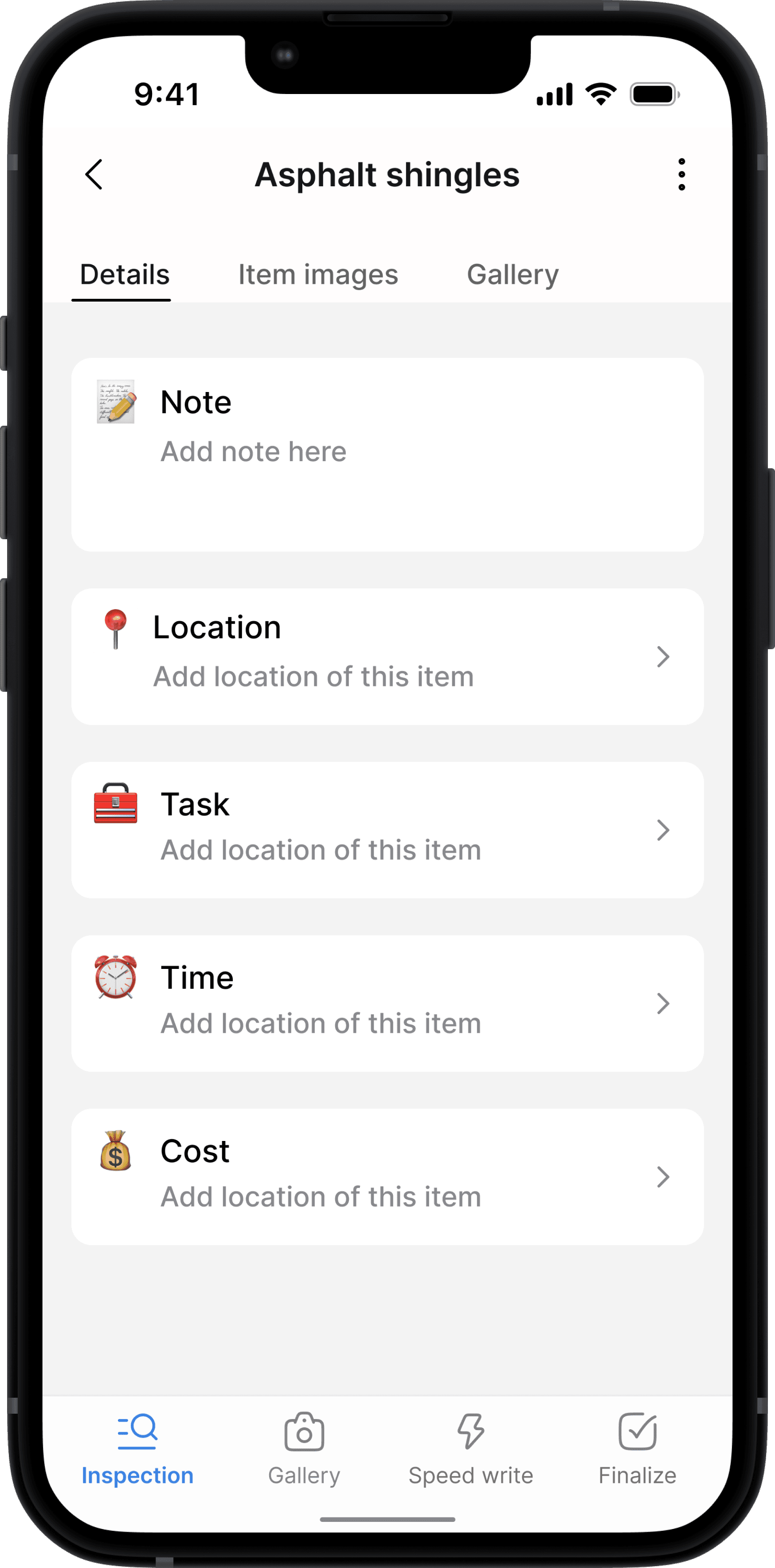
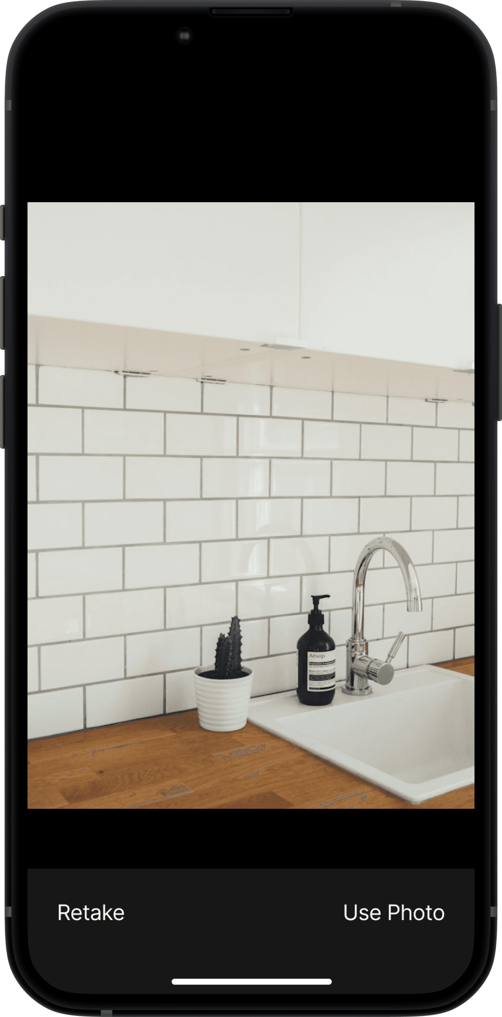
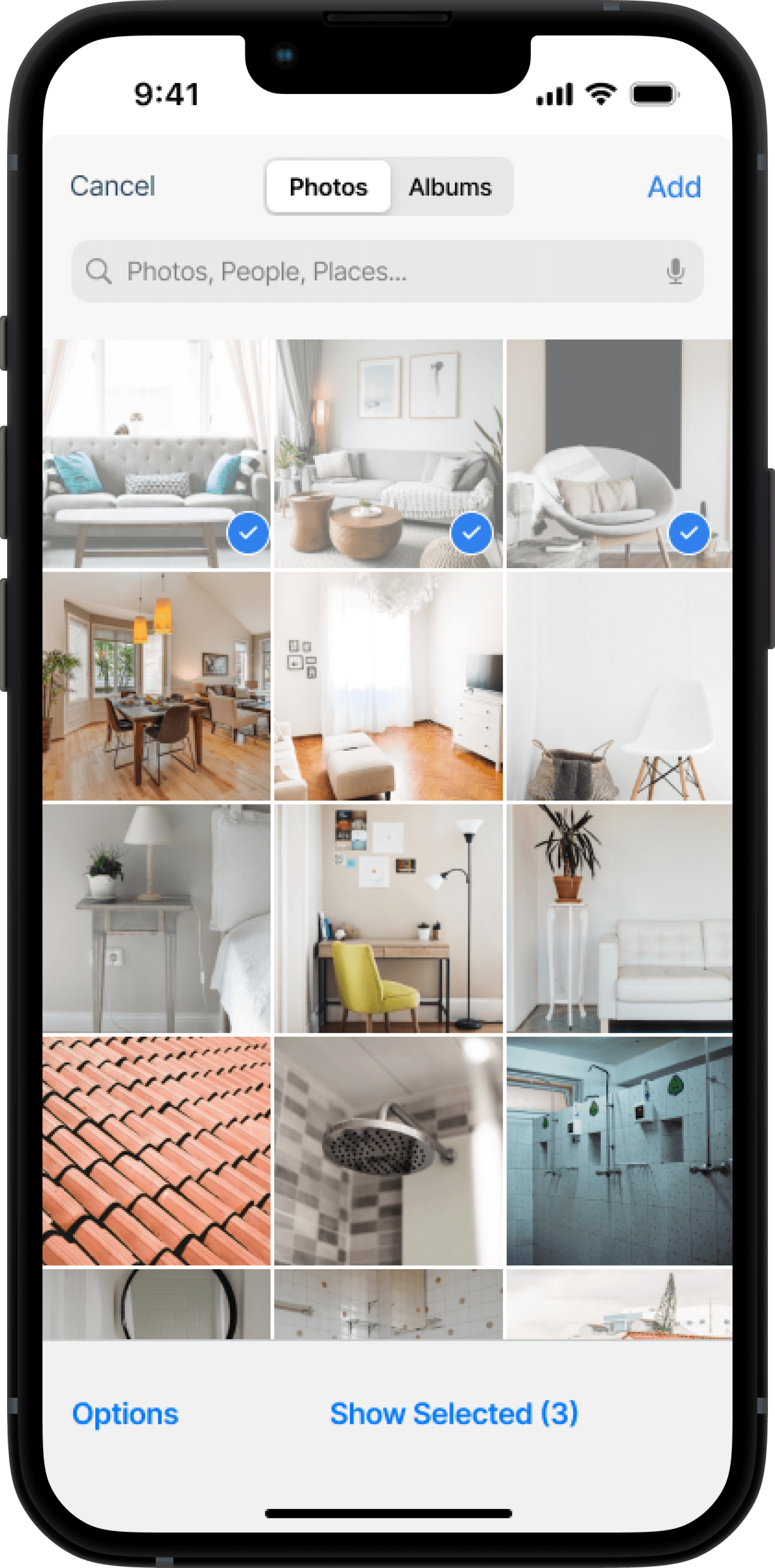
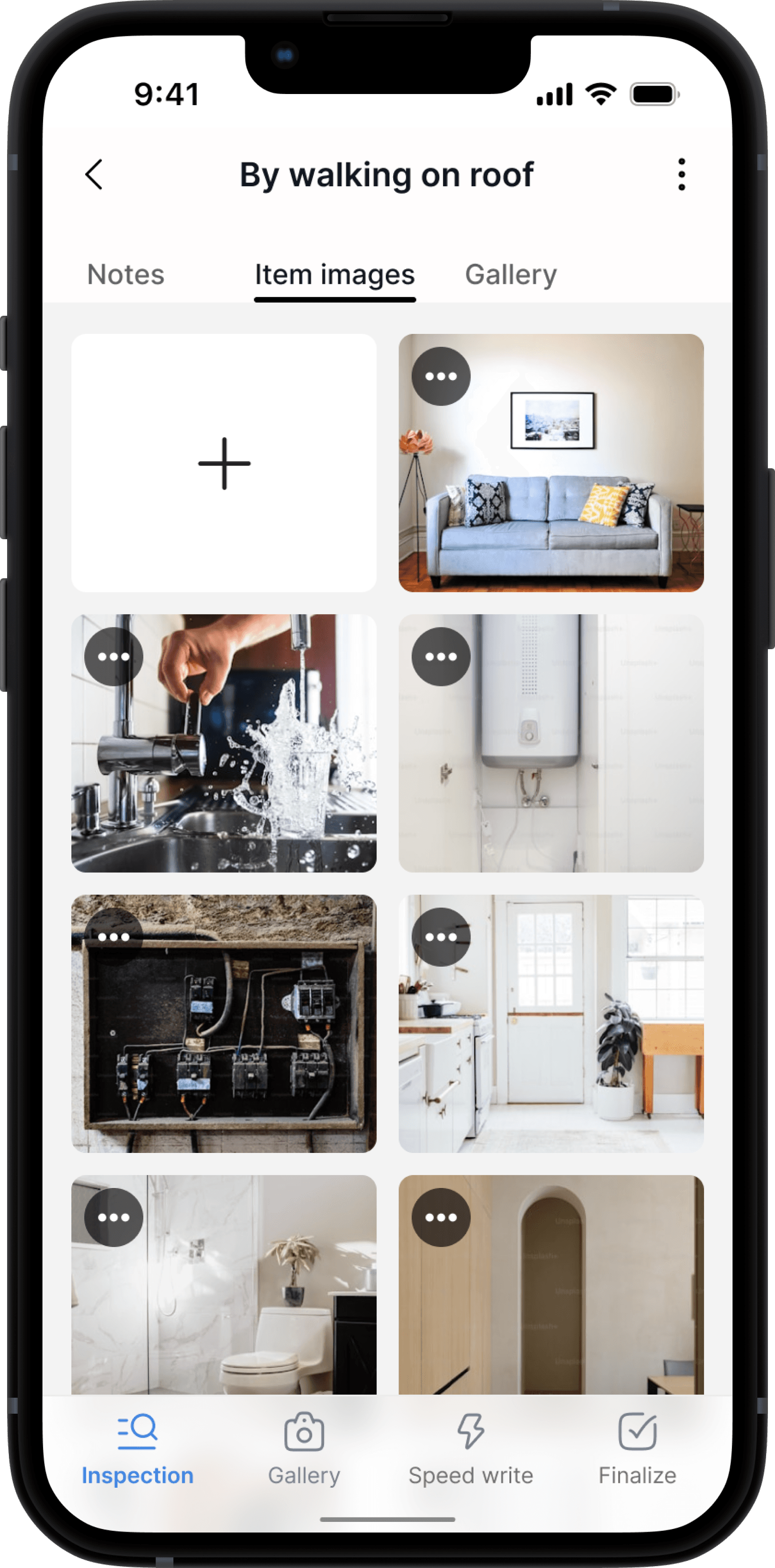
The Description subheading is used for general descriptions of the property, detailing aspects like the material, age, shape, and form of the items. Users can also attach images and notes for each item under this subheading.
Observations & Recommendations flow
Documenting Condition and Providing Repair Recommendations in Horizon
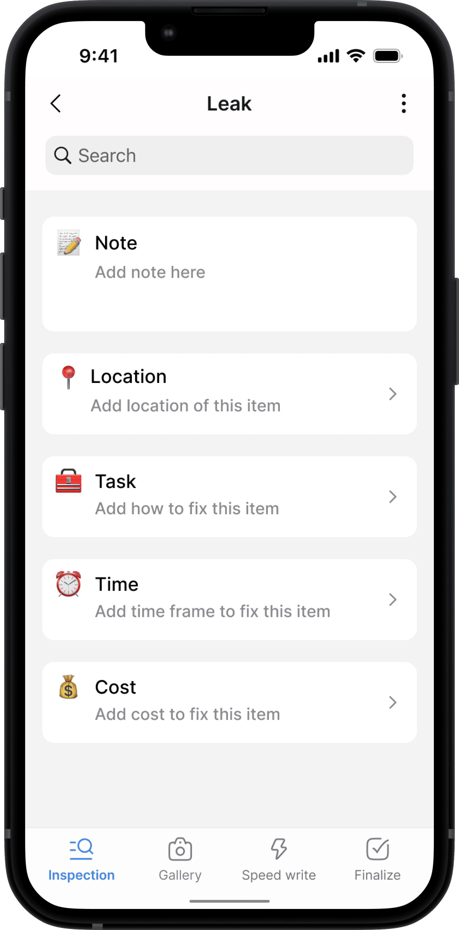
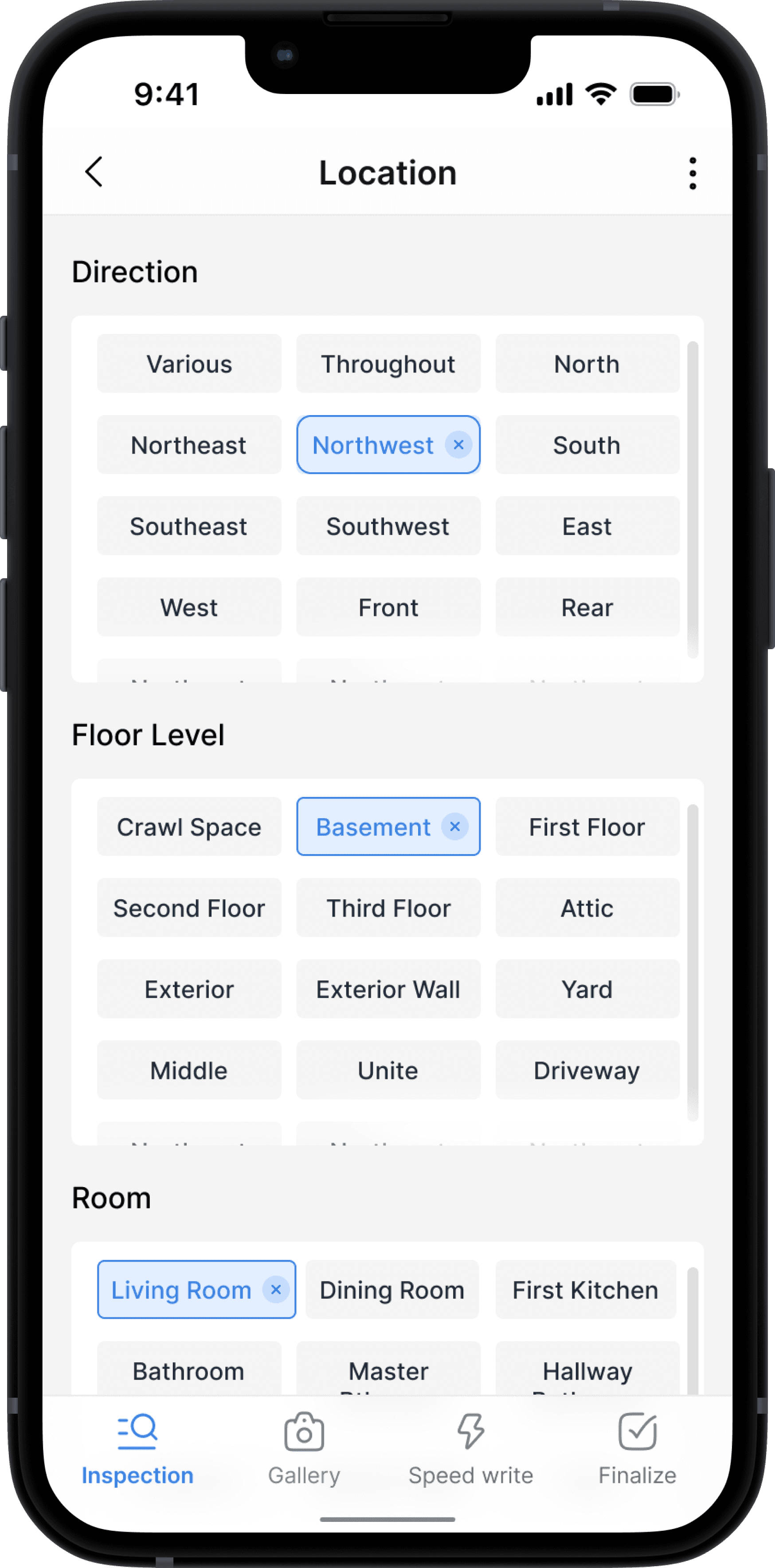
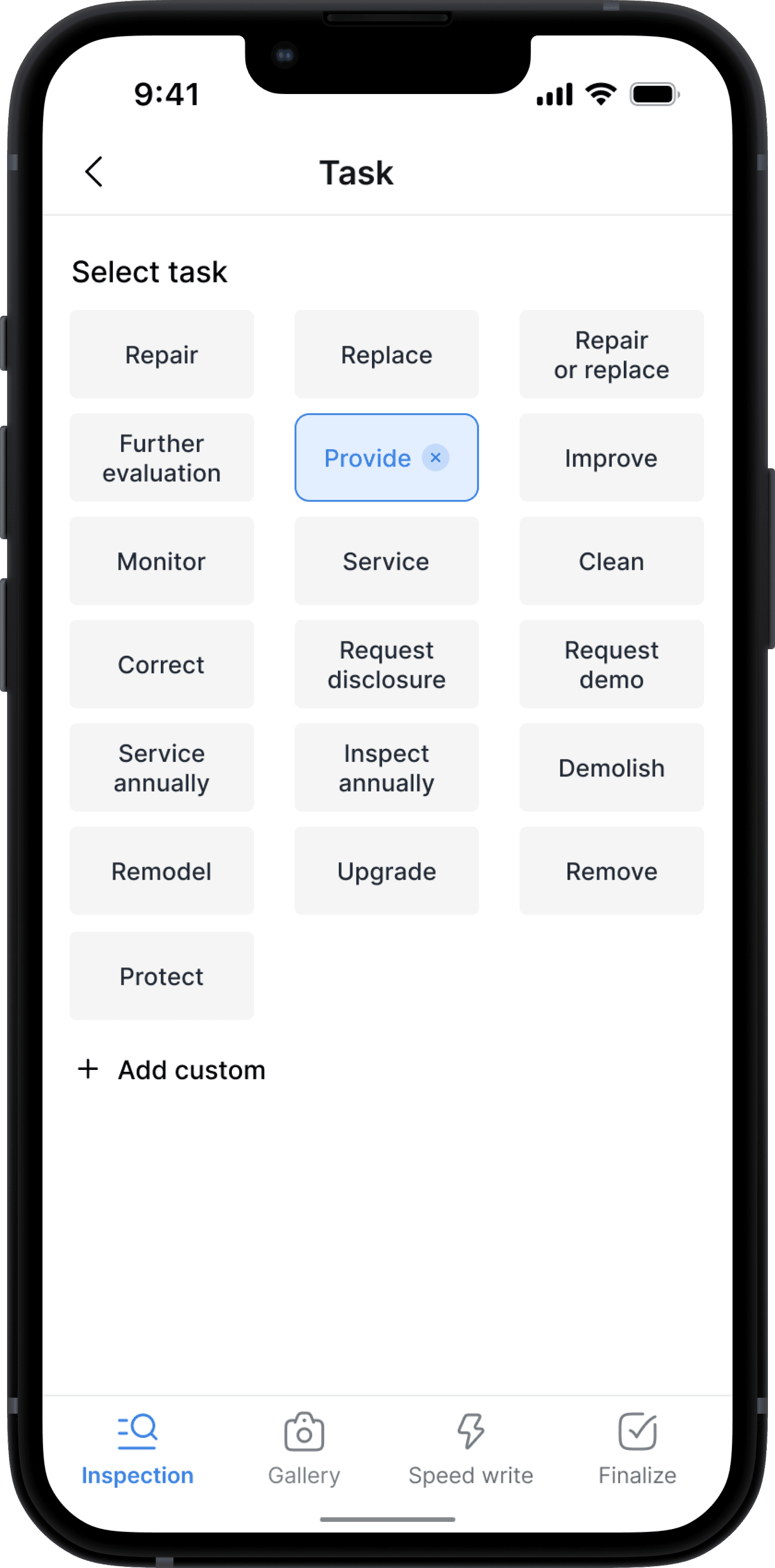
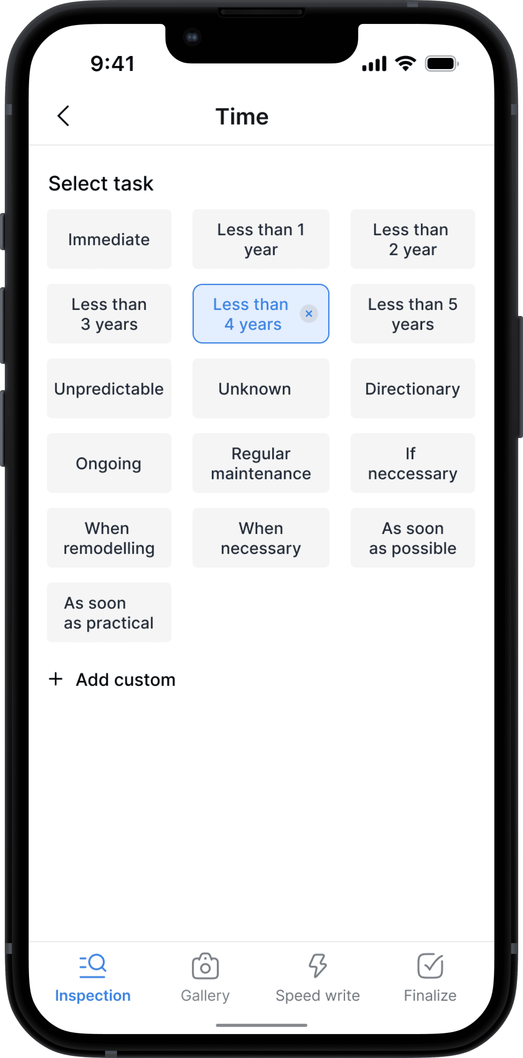
The Observations and Recommendations subheadings let users note material conditions, such as wear or damage, and suggest repairs, including what to fix, when to fix it, and the estimated cost.
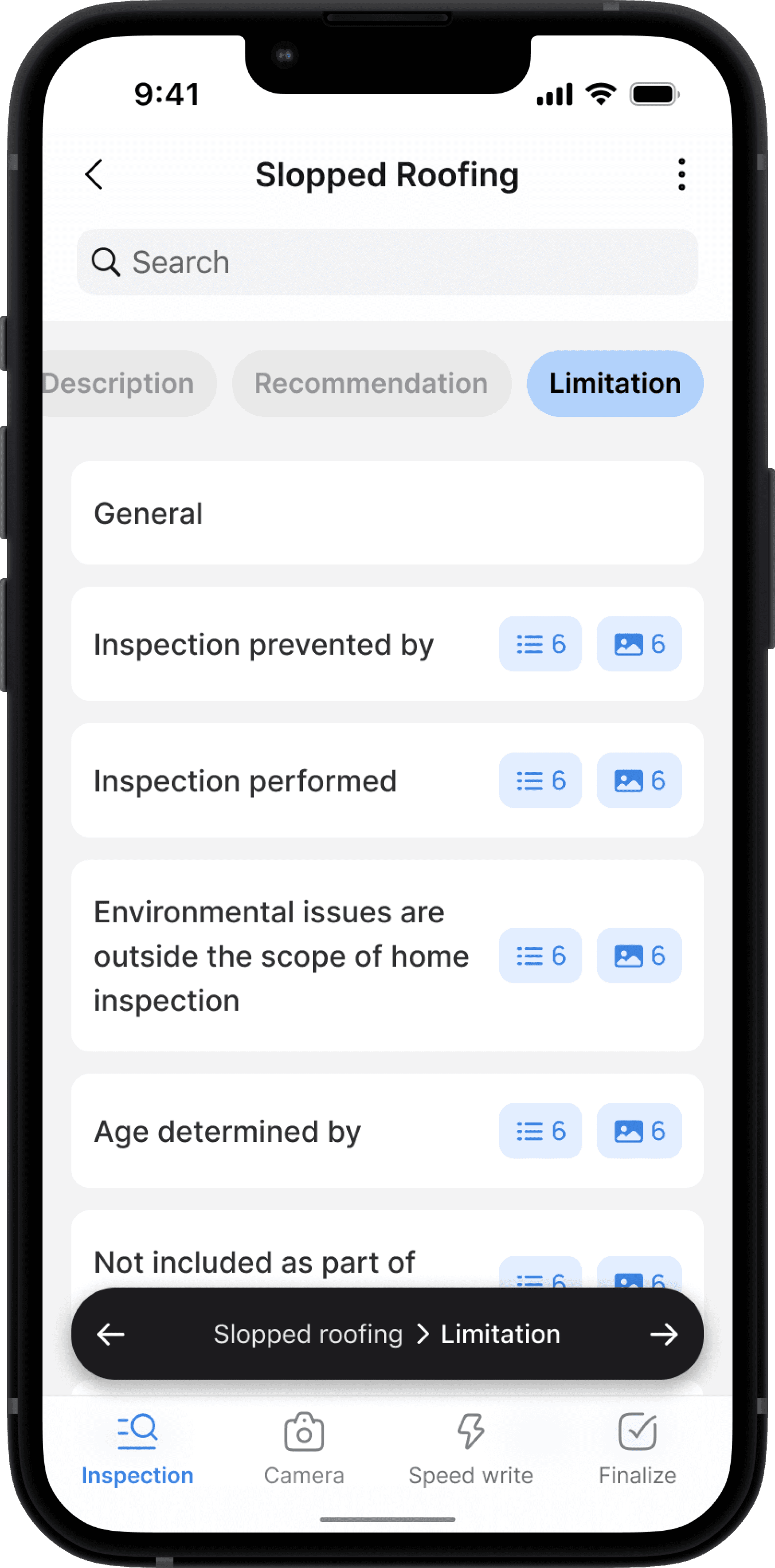
Limitation flow
Communicating Inspection Limitations and Challenges in Horizon
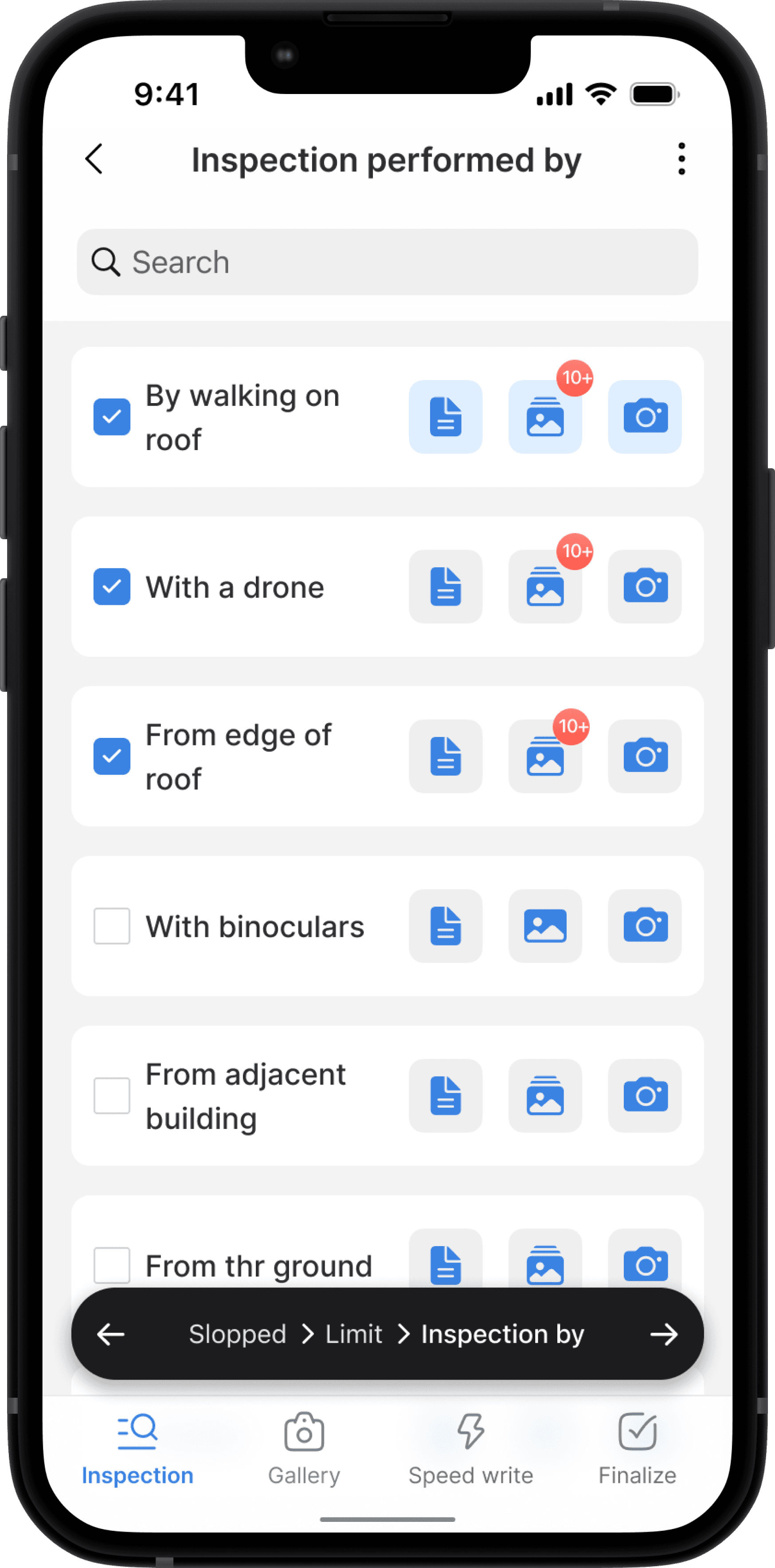
The Limitations subheading informs the client about how the inspection was conducted, what wasn’t inspected, and any obstacles that prevented a full inspection. Users can also include visual images and notes for clarity.
Implementaion
Implementation
The mobile inspection platform was successfully implemented through strategic collaboration between design and development teams, ensuring seamless translation of UX improvements while maintaining critical workflows.
Outcomes
Project Outcome and Challenges Due to Organizational Changes
While the platform launched successfully, long-term metric tracking was interrupted due to organizational changes. To measure success and impact, I would have monitored the following:
Elevated platform usage and positive feedback, indicating inspectors found the new system more efficient
Increased daily active users, showing strong adoption of modernized workflows
Growth in successful migrations from the legacy system, reflecting the smooth technical transition
Lower support tickets and higher retention rates, demonstrating improved user satisfaction
Decreased error rates in inspections, suggesting better data entry and validation systems
Faster onboarding completion times, indicating a more intuitive interface design
Lessons
Lessons Learned
User Research Impact: Field research with inspectors proved invaluable, revealing critical insights about mobile workflows and real-world usage patterns. Direct observation and testing helped validate design decisions in staging environments.
Iterative Design Process: Regular feedback loops enabled quick adjustments to meet specific inspector needs, balancing familiar workflows with modern improvements.
Industry-Specific Insights: Working with field inspectors revealed unique requirements for their mobile workflow: the need for simple, efficient interfaces with minimal interactions, robust offline functionality, easy one-handed operation, and streamlined data entry methods. These insights fundamentally shaped our approach to mobile-first design for field operations.
