Elevating Home Inspections: A Strategic Redesign of Horizon App by Carson Dunlop
Overview
About Company
Carson Dunlop's Horizon Inspection App is the leading software solution for professional home inspectors, enabling them to document properties and generate comprehensive reports for clients across North America.
The Challenge
Carson Dunlop approached me with a critical challenge: to redesign their Horizon mobile app for professional home inspectors. The company had received alarming feedback indicating that inspectors were facing significant usability issues, outdated UI and limited functionality compared to the desktop version. These problems led to a 23% loss of users to competitors in the past year and hindered new user acquisition, threatening Horizon's market position.
THE TEAM
Carson Dunlop approached me with a critical challenge: to redesign their Horizon mobile app for professional home inspectors.
MY ROLE
As the product designer, I spearheaded the redesign effort from start to finish. I conducted in-depth user research, including interviews, data analysis, and usability testing, to uncover the root causes of the issues and identify areas for improvement. Based on these findings, I defined a clear design strategy, created high-fidelity mockups and interactive prototypes, and collaborated with cross-functional teams to bring the new design to life, ensuring a significantly improved mobile experience for home inspectors.
OUTCOMES
Improved reliability and user satisfaction
53% decrease in support tickets related to data loss
22% increase in user satisfaction scores
Discovery
STARTING ON A SHARED UNDERSTANDING
To kick off the redesign, we conducted stakeholder interviews to align on business goals, timelines, and product vision. We established the project's primary goals:
PROJECT GOALS
Modernize the interface while maintaining Horizon's reliable core functionality
Streamline inspection workflows to improve user efficiency
Reduce user frustration with day-to-day inspection tasks
Retain existing users by delivering a more intuitive experience
SUCCESS METRICS
Decrease in user churn rate from 23% to under 10% -
Increase user satisfaction scores by 40%
Improve task completion rates during inspections
Reduce user support tickets related to interface issues by 50%
By collaborating closely with stakeholders from the outset, I ensured that everyone had a clear understanding of the project objectives and success criteria. This shared foundation set the stage for effective decision-making and problem-solving throughout the redesign process.
Research & Analysis (Understanding User Needs)
Initial feedback suggested that usability issues and limited functionality were the main culprits. As the product designer on the project, my first task was to investigate these concerns and develop a clearer understanding of the problem space. To which I conducted a thorough discovery phase, which included:
1.
Analyzed app usage data, support tickets, and user reviews
2.
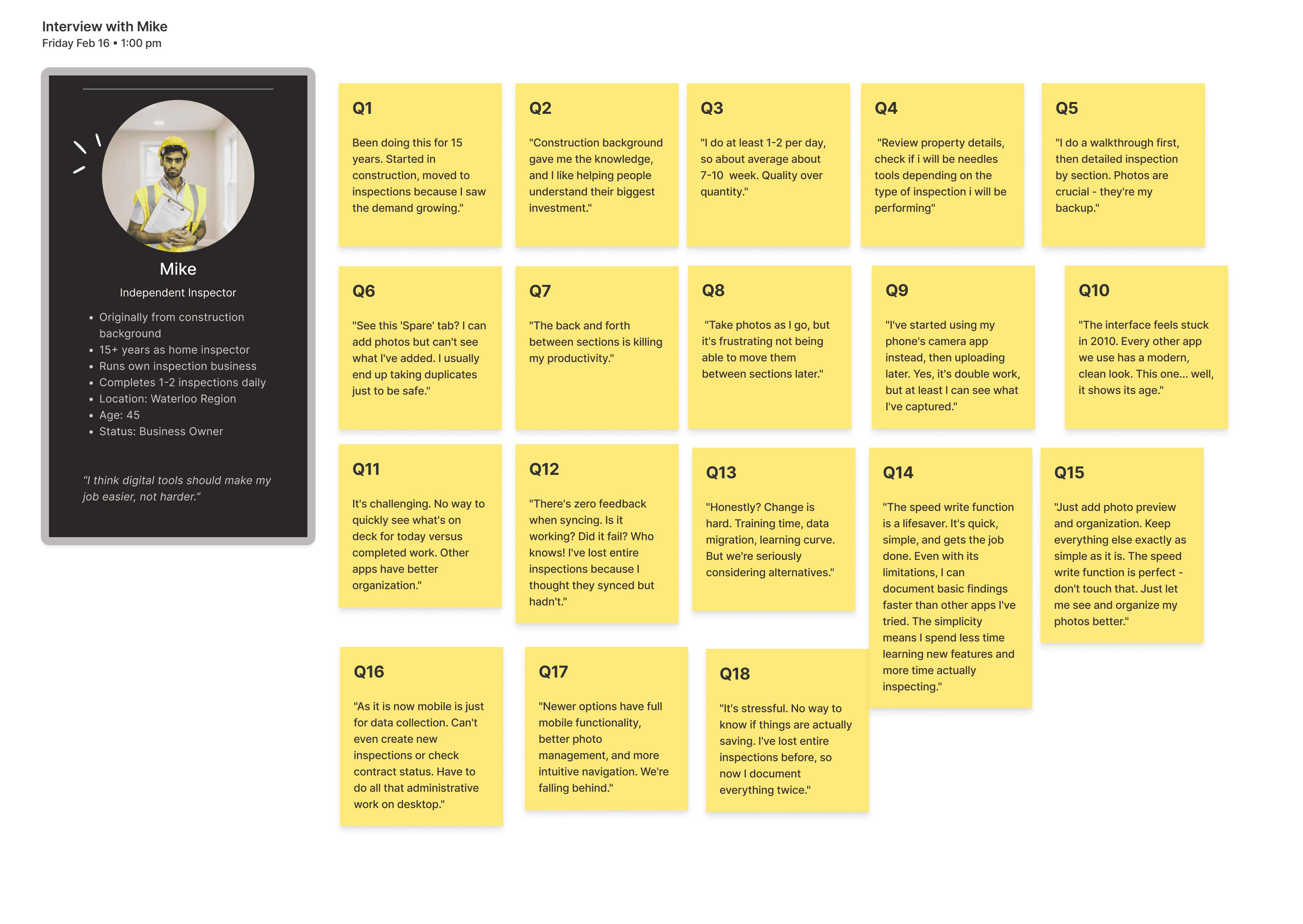
Interviewed 12 home inspectors to understand their workflows and needs
3.
Benchmarked competitor apps to identify industry best practices
4.
Mapped out existing user flows and screens to identify pain points
Current app analysis
Understanding how inspectors move through their daily workflow to identify critical pain points and opportunities for improvement.
In my analysis of the current inspection workflow, I identified several critical mobile usability issues that are impacting the daily work of inspectors. The main pain points include limited mobile booking features, basic photo capture functionality, synchronization and offline issues, a lack of a media gallery, and insufficient feedback for interactions, among others. This analysis highlighted how these mobile limitations affect the efficiency of inspectors throughout their inspection process.
Usability Audit
The usability audit uncovered critical issues in Horizon's mobile app that slow down inspectors' daily workflows.
Key problem areas include the appointment management system, search functionality, navigation design, interaction clarity, and information presentation. By addressing these gaps between the app's capabilities and inspectors' needs, there is significant potential to streamline the inspection process and boost field efficiency.


User Interviews
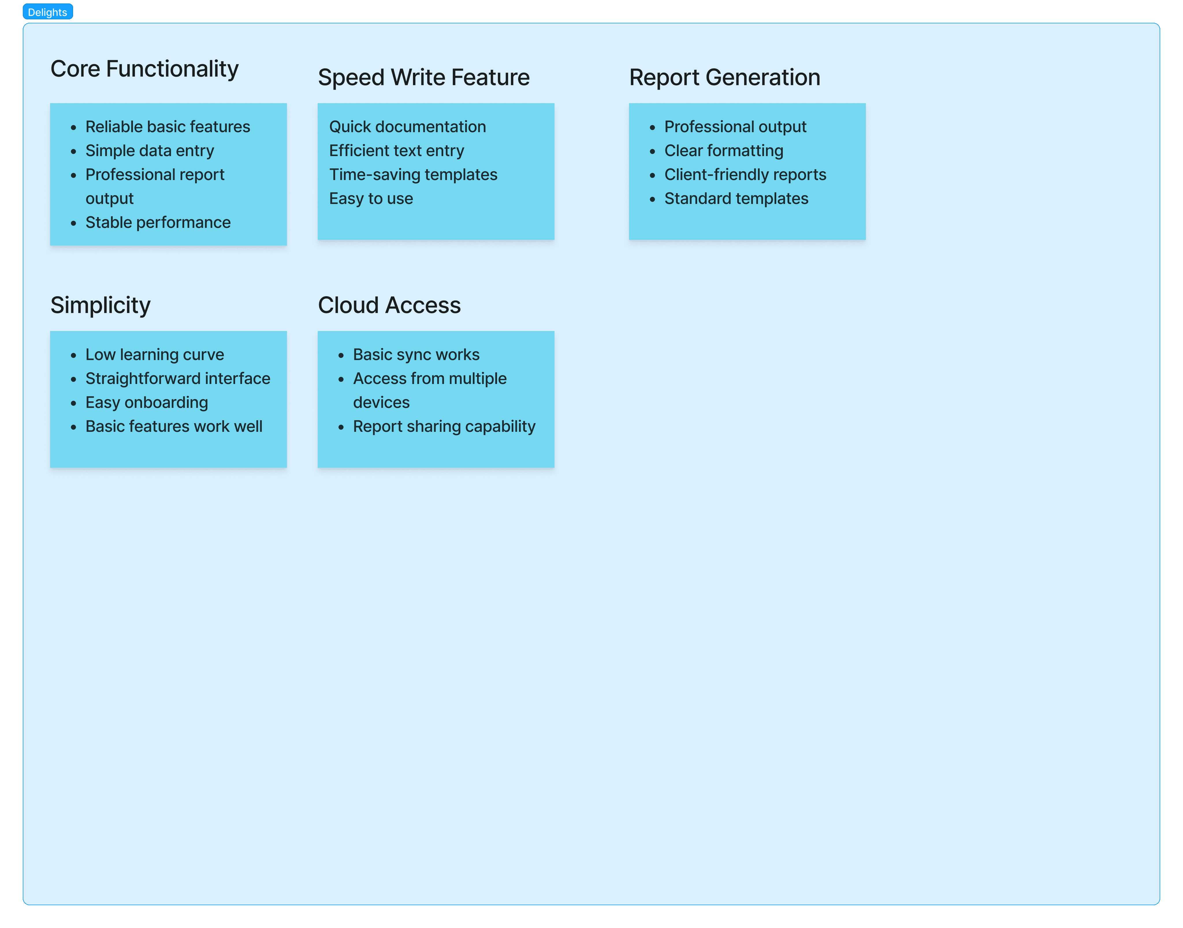
Working with the product team, we: Organized 100+ user quotes and observations Identified common patterns and themes Grouped feedback into key categories: Pain Points, Delights and Suggested Solutions
Our research revealed a fundamental disconnect between Horizon's current design and inspectors' workflows. While users value certain features like speed write and cloud access, critical issues with photo management, navigation, and mobile functionality are pushing them toward competitor solutions.

Competitor Analysis
Analysis of leading inspection platforms like InspectIT, HomeGauge, and Spectora revealed a clear market standard: 4.6+ star apps offering robust offline capabilities, custom templates, and integrated photo management. This gap between competitor offerings and Horizon's current features helps explain our declining market position.
Research Insights ➙ Design Decisions
Through this discovery process, we uncovered several key insights that helped refine our problem definition: Inspectors were generally satisfied with the core functionality of the app but found the interface outdated and cumbersome to navigate.
Updated Visual Design
"The interface feels stuck in 2010. Every other app we use has a modern, clean look. This one... well, it shows its age."'
No photo preview
Can't reorganize images
Limited organization optionsn
Streamlined Photo Management
"See this 'Spare' tab? I can add photos but can't see what I've added. I usually end up taking duplicates just to be safe."
Single photo capture limitation
No photo gallery view
Missing autosave indicators
Limited annotation tools
Limited organization options
Navigation Complexity
"The interface feels stuck in 2010. Every other app we use has a modern, clean look. This one... well, it shows its age."'
No photo preview
Can't reorganize images
Limited organization optionsn
Sync & Offline Issues
"There's zero feedback when syncing. Is it working? Did it fail? Who knows! I've lost entire inspections because I thought they synced but hadn't."
No visible syncing indicators
Lost data during connectivity issues
These insights informed our design decisions:
Updated Visual Design
Design Decisions
Modern, clean look aligned with brand
Improved information hierarchy and visual cues
Streamlined Photo Management
Design Decisions
Batch photo capture and processing
Gallery view for easier photo organization
Better photo annotation tools
Navigation Complexity
Design Decisions
Gesture navigation
Quick actionsStatus feedback
Modern layout
Offline Reliability
Implemented background syncing with clear status indicators
Designed offline support for uninterrupted work
Context-Aware Interface
Bottom navigation for one-handed use
Quick action floating button Gesture-based
interactions Smart defaults based on location
Process
Constraints
Preserving Familiar Workflows
Our research showed that existing users, particularly experienced inspectors, had built their daily routines around Horizon's current workflows. Making dramatic changes could disrupt their efficiency and risk losing their loyalty.
To ensure user loyalty, particularly among experienced inspectors, we focus on maintaining Horizon’s established workflows while introducing gradual improvements. My plan includes the following:
Inspection Flow: Retain the current setup-inspect-report structure, adding shortcuts without altering familiar organization.
Photo Documentation: Maintain the capture-label-organize process while offering optional enhancements for flexibility.
Report Generation: Keep trusted templates and export formats, introducing new templates incrementally.
Implementation Strategy:
Use progressive enhancement to layer new features over existing workflows and a gradual transition with in-app guidance to minimize disruption while modernizing the platform.
Opportunity✨✨
How might we preserve familiar workflows in Horizon while introducing new features that enhance efficiency and flexibility, ensuring a seamless transition for experienced users
DESIGN PROCESS
Information Architecture
I did the Information Architecture of the current app, uncovering key insights like the need for clearer visual hierarchy, global navigation, quick-action shortcuts, and status indicators. Building on this, I preserved most of the existing user flows while adding advanced features to enhance functionality. I mapped out critical tasks, such as starting a new inspection, checking today’s schedule, and reviewing past reports, ensuring the navigation remained intuitive and aligned with the IA. These flows efficiently guided users through time-based and action-based groups while addressing their core needs.
Iterations & Testing Concepts
Through iterative design, driven by concept testing and feedback, I refined key features of the app. Below are the major changes made based on insights gathered from user testing and internal design critiques


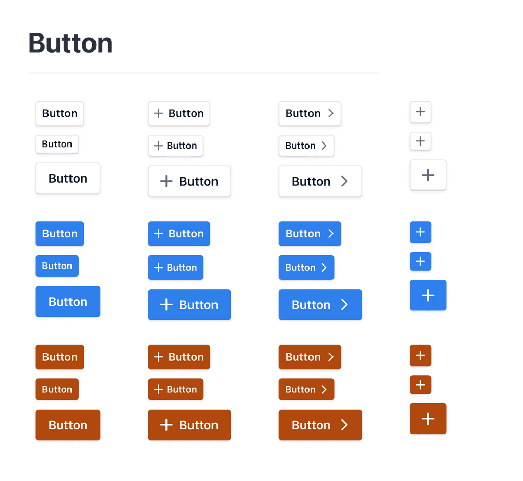
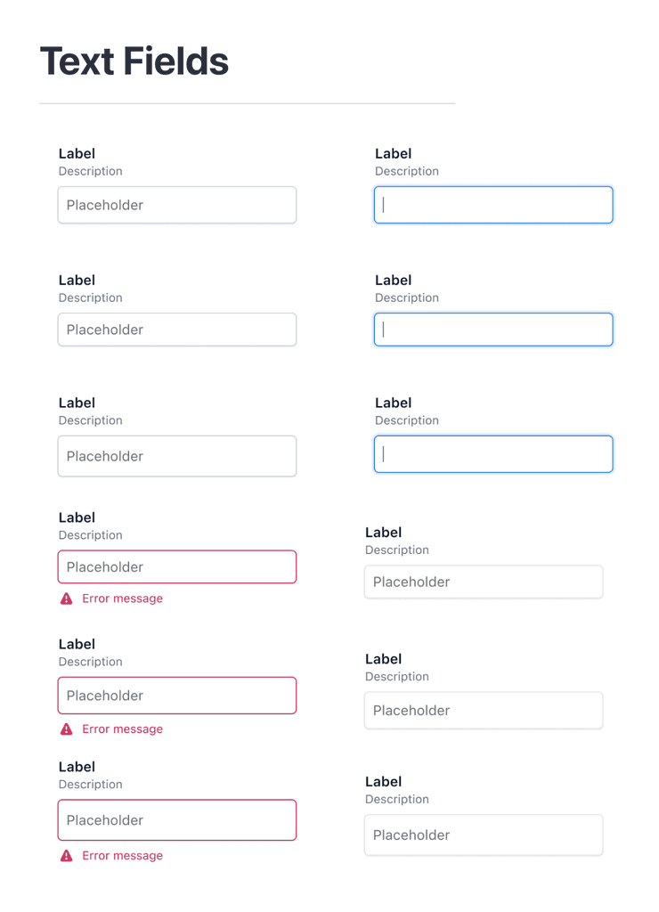
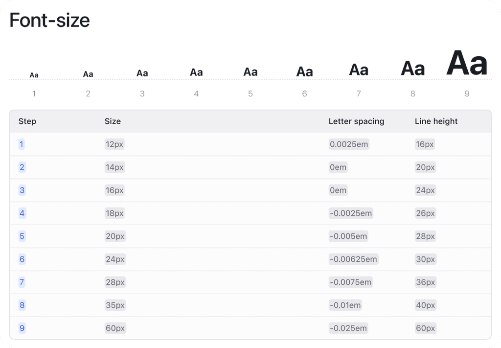
Visual Design & UI Kit
Established visual design direction blending Carson Dunlop's brand with modern mobile UI
Created comprehensive, responsive UI component kit covering all common patterns
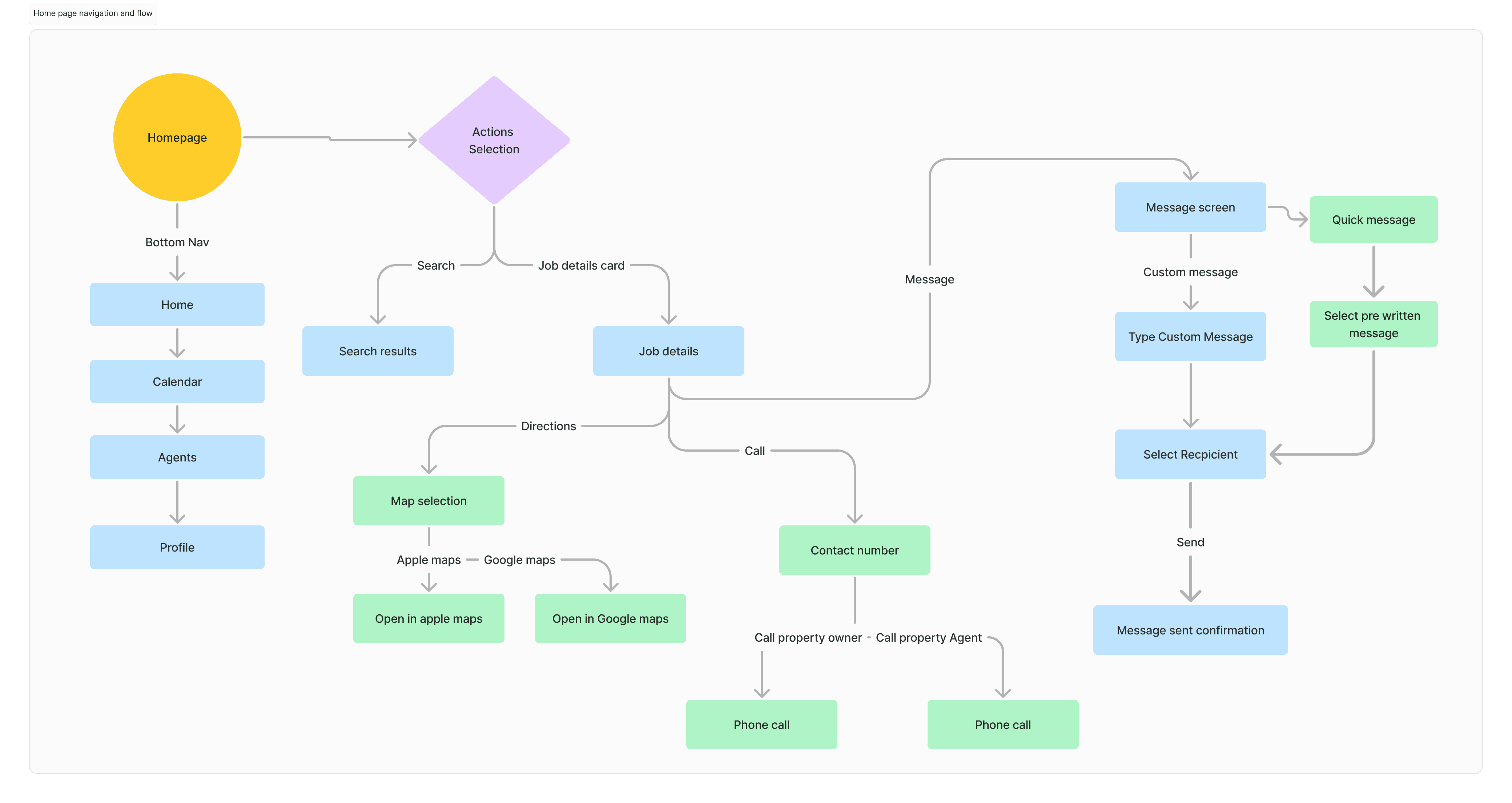
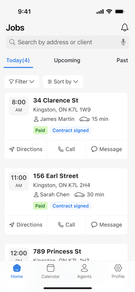
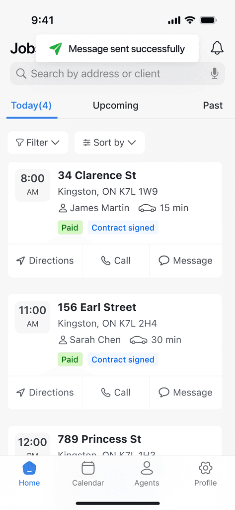
✅ Homepage key improvements
Key improvements include streamlined navigation, quick actions, and clear status indicators that reduce interaction steps by 50%. The new card-based layout with timeline organization brings critical information forward, while quick message templates and organized contacts enhance communication workflows.
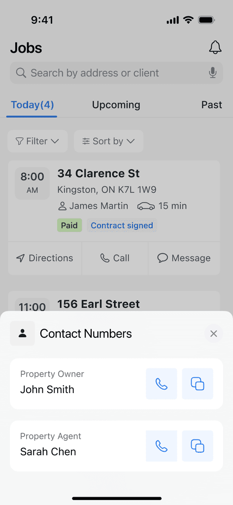
Homepage
Call Button
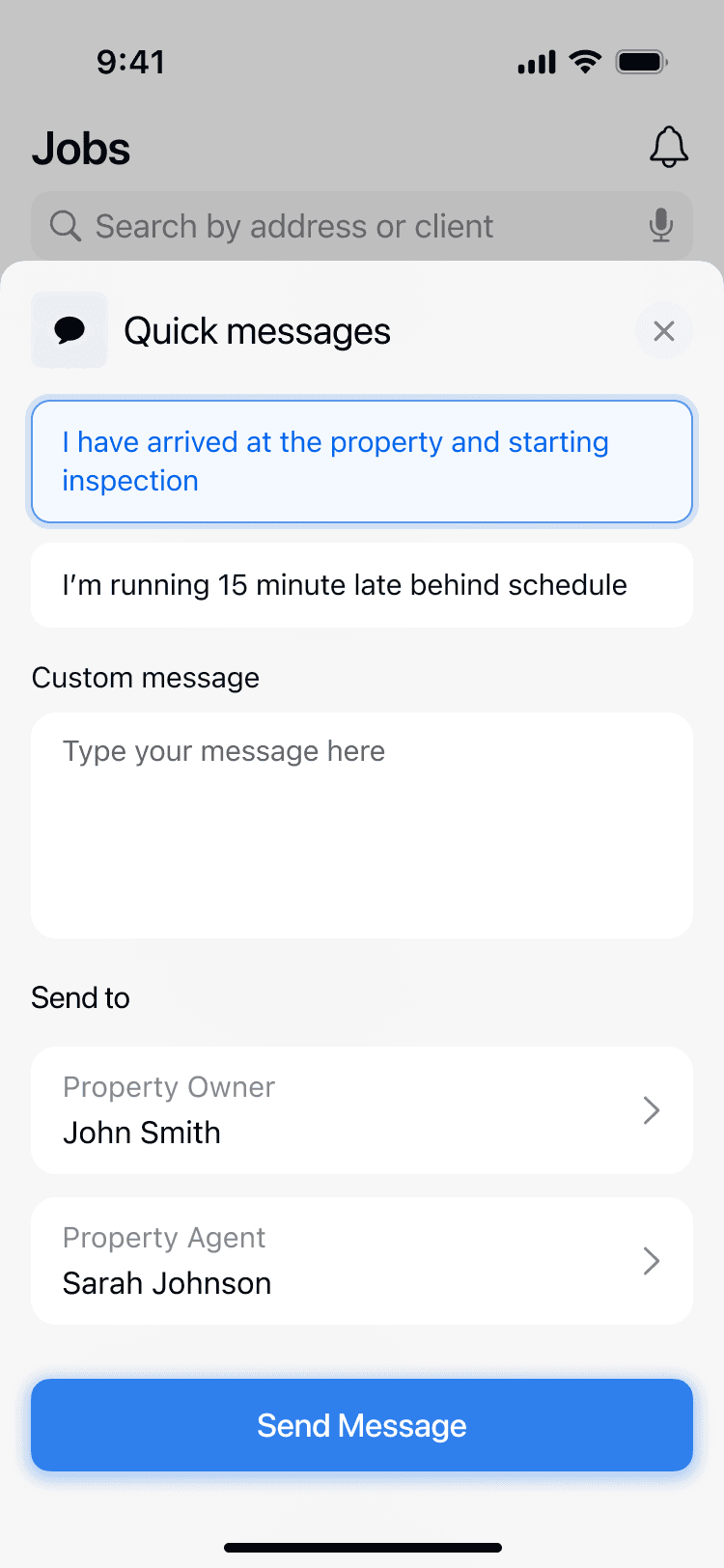
Message screen
Feedback
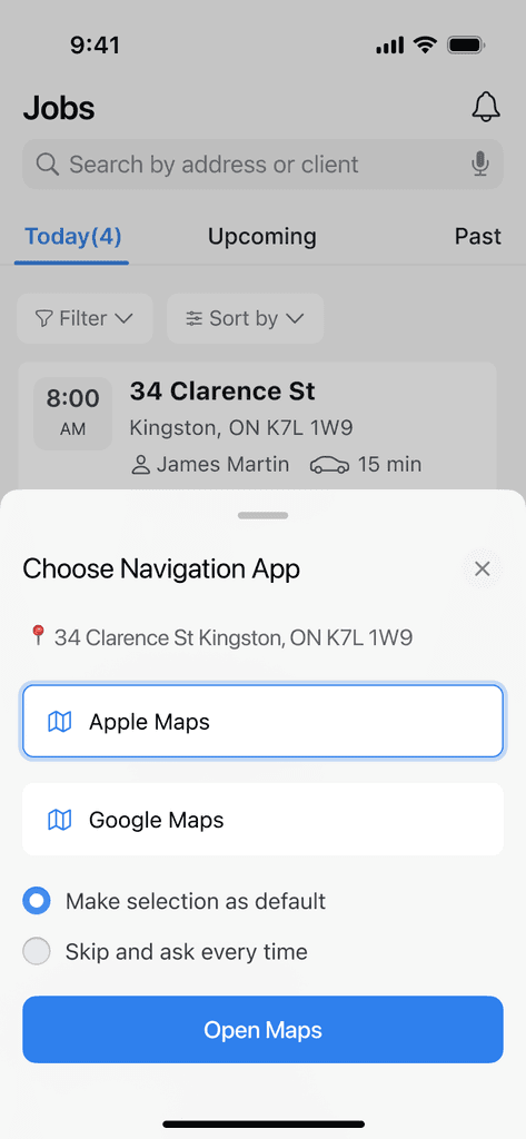
Maps
✅ Homepage key improvements
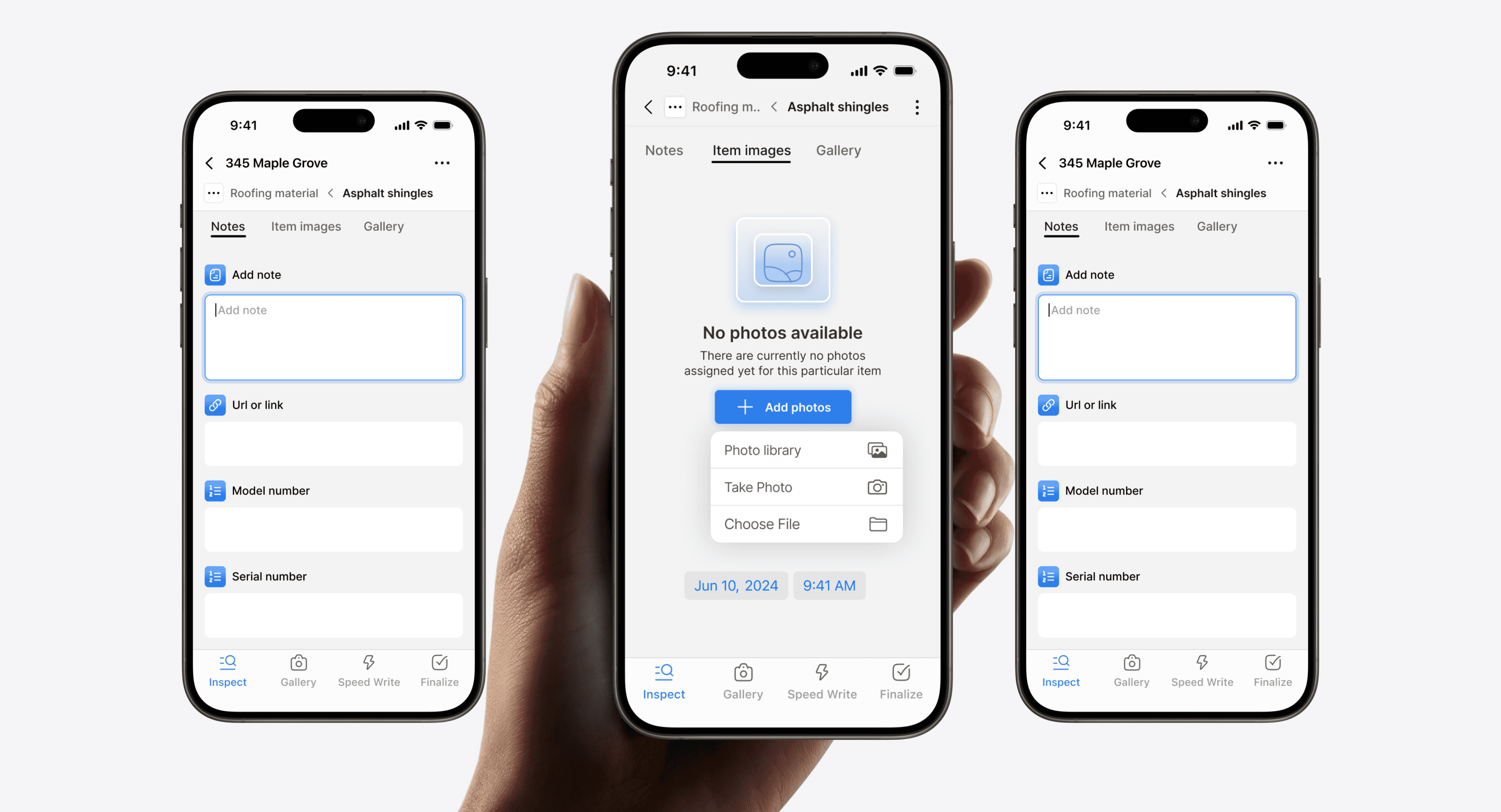
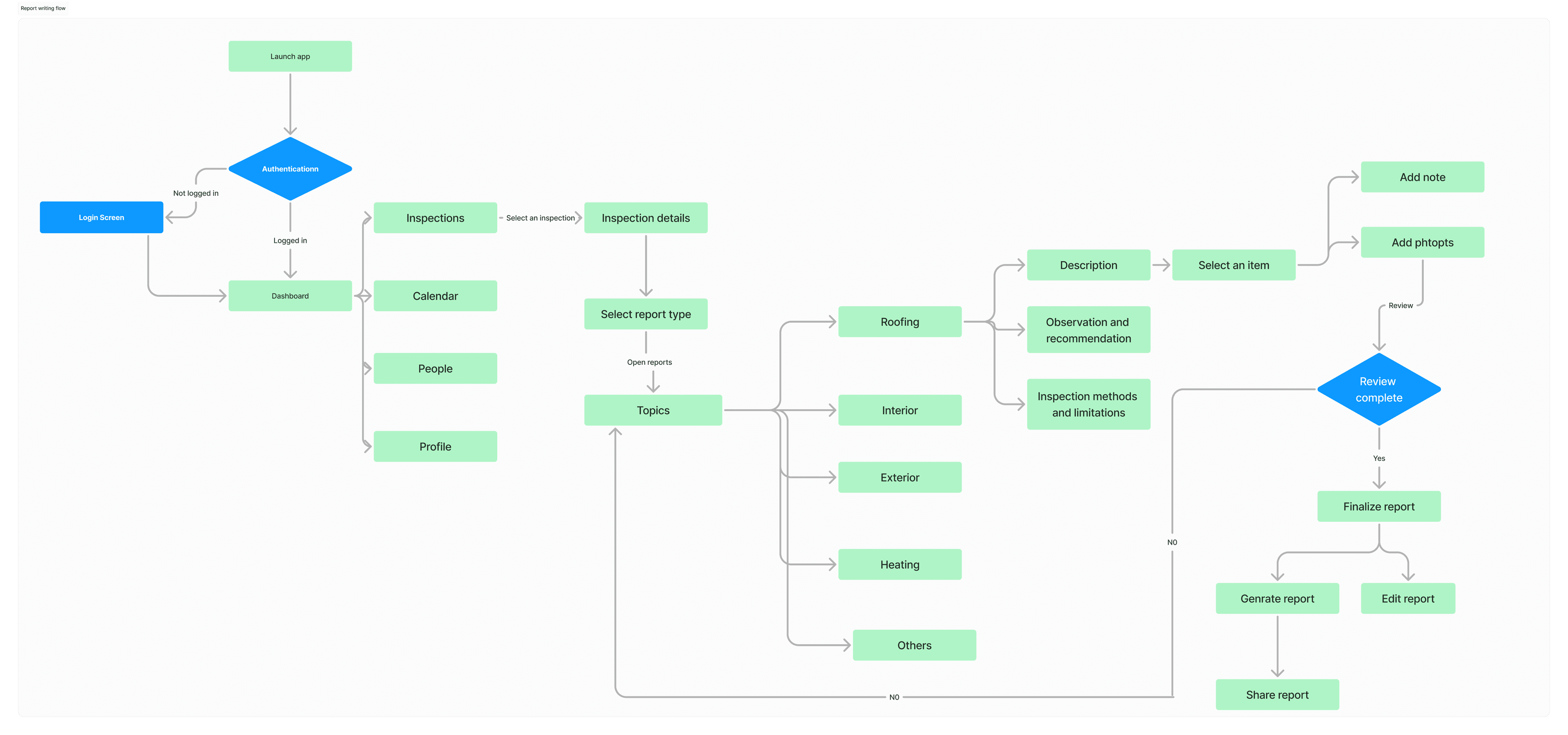
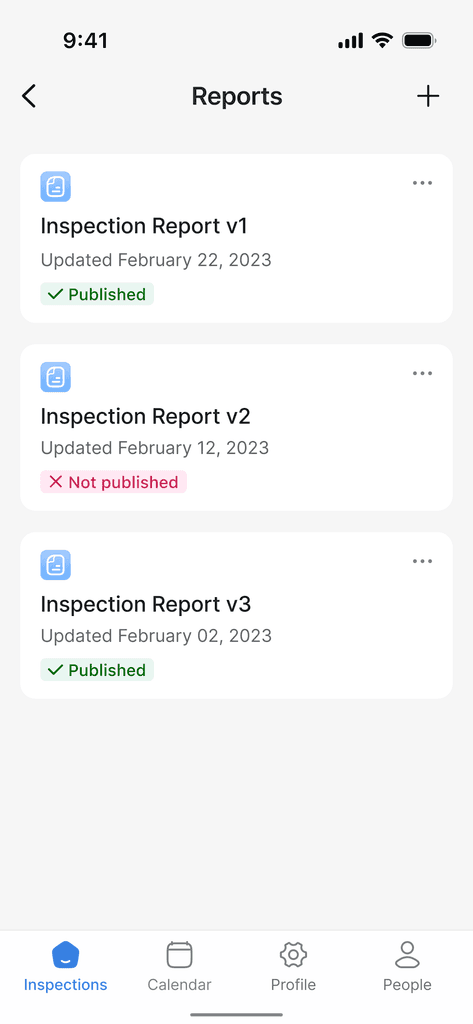
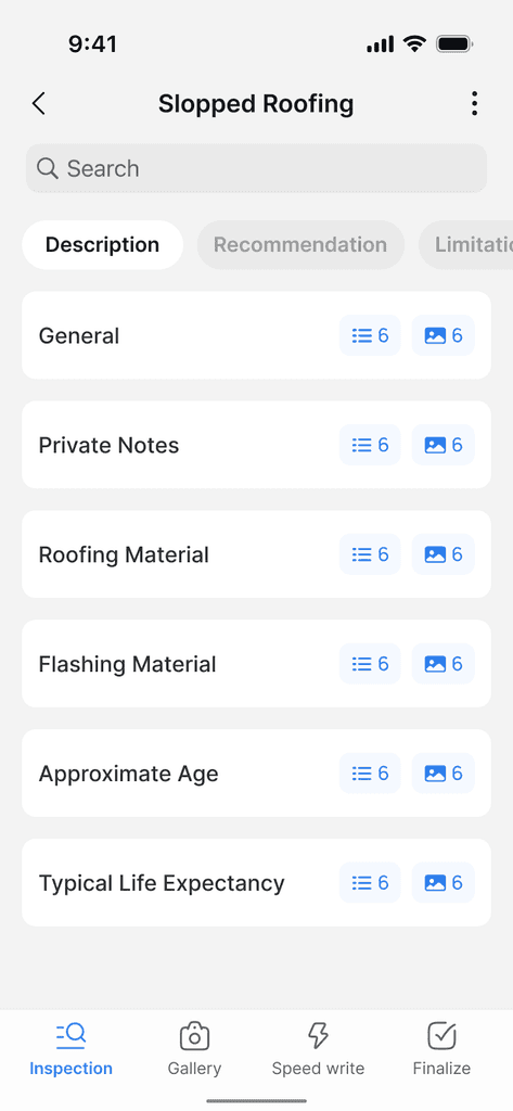
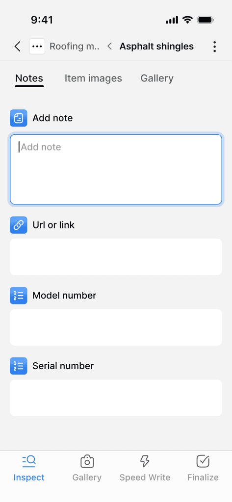
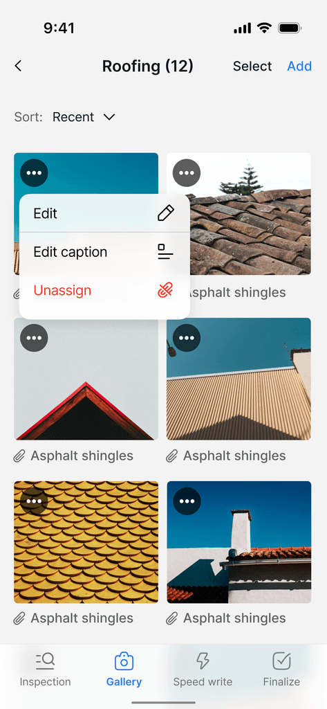
"Through user research, we discovered that home inspectors typically focus on one inspection per session. This is because inspections are time-sensitive and require undivided attention to ensure thorough and accurate reporting." To address this, we introduced a dedicated inspection mode, which creates a focused workspace for inspectors once an inspection is selected. In this mode, the global bottom navigation is replaced with task-specific options — 'Inspect,' 'Gallery,' and 'Finalize' — tailored to the inspection process."

✅ Homepage key improvements
Key improvements include streamlined navigation, quick actions, and clear status indicators that reduce interaction steps by 50%. The new card-based layout with timeline organization brings critical information forward, while quick message templates and organized contacts enhance communication workflows.
Homepage

Call Button
Message screen

Feedback
Maps

Maps

Final designs
Key improvements include streamlined navigation, quick actions, and clear status indicators that reduce interaction steps by 50%. The new card-based layout with timeline organization brings critical information forward, while quick message templates and organized contacts enhance communication workflows.
Homepage
Homepage

Call Button

Message screen

Maps

Maps

Maps
Insight 2
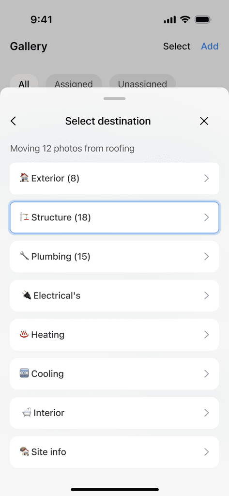
Streamlined Photo Management
Unable to duplicate photos within the system
Can't copy or move photos between sections
No ability to reorder photos after upload
Extra time spent retaking photos unnecessarily
Streamlined Photo Management
Unable to duplicate photos within the system
Can't copy or move photos between sections
No ability to reorder photos after upload
Extra time spent retaking photos unnecessarily
Homepage

Message screen

Maps
Maps

Maps

Maps
✅ Homepage key improvements
Key improvements include streamlined navigation, quick actions, and clear status indicators that reduce interaction steps by 50%. The new card-based layout with timeline organization brings critical information forward, while quick message templates and organized contacts enhance communication workflows.
Homepage

Call Button

Message screen

Maps
Maps

✅ Homepage key improvements
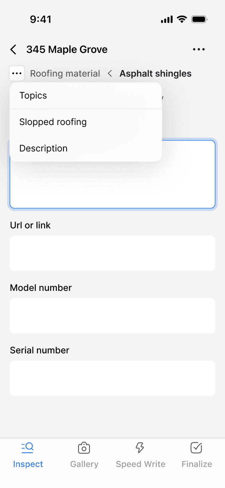
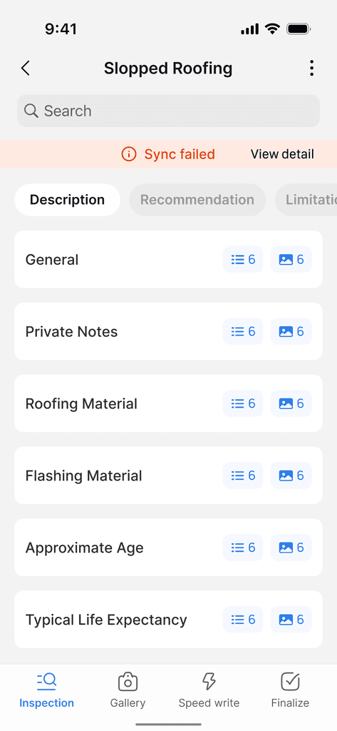
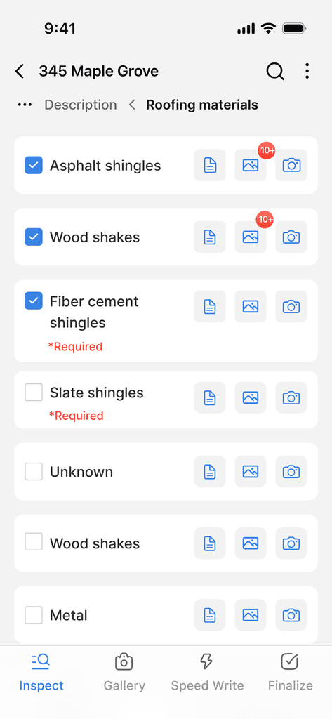
Our final design implements a two-tier navigation system that prioritizes context while maintaining efficiency. The property address ("345 Maple Grove") takes prominence at the top level, providing constant location awareness. Below this, a breadcrumb trail shows the inspector's position within the inspection hierarchy ("Roofing material > Asphalt shingles").
Call Button

Call Button

Homepage
Homepage

Call Button